Preston North End 2026-27 Home Kit by Castore Revealed

Preston North End 26/27 Castore Home Kit

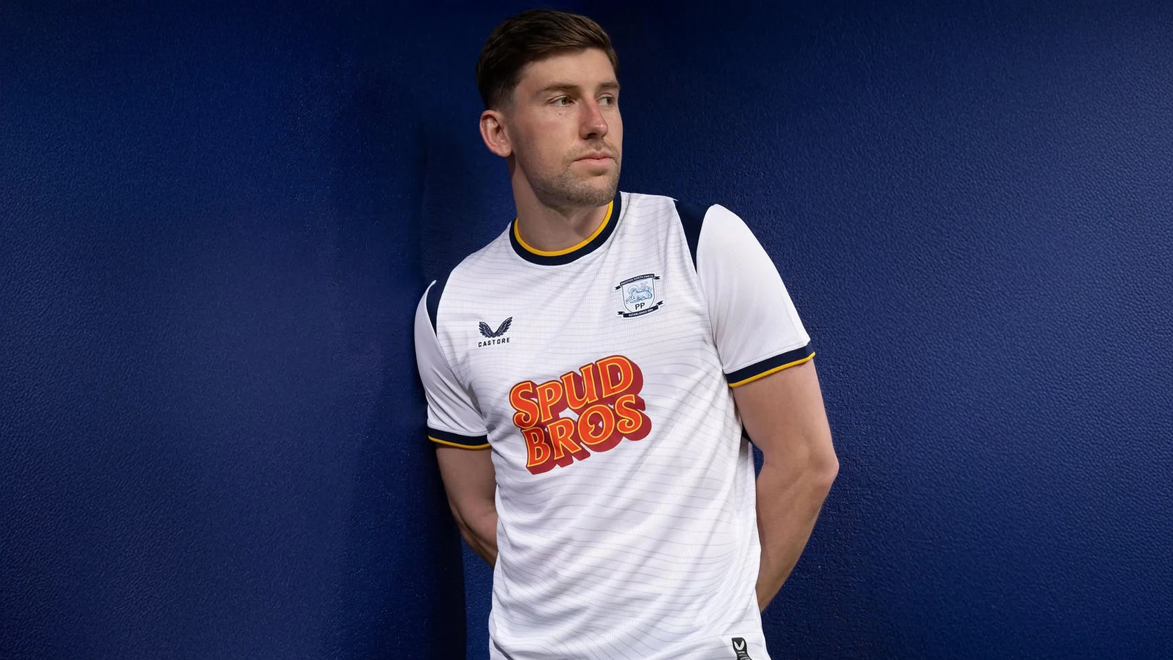
Preston North End Football Club and Castore have revealed the Preston North End 26/27 Home kit for the 2026-27 EFL Championship season.

Preston North End Kit Design & Inspiration

The new Preston North End jersey is presented in the club’s traditional white, with a subtle tonal line graphic running across the front panel. Navy detailing is used on the shoulder sections and around the collar, with yellow trim added to the neckline and sleeve cuffs.

The front features the Castore logo on the right chest and the Preston North End crest on the left, shown in a navy and light blue finish with “Established 1880” included below the lamb emblem. SpudBros continues as the main shirt sponsor for a 2nd consecutive season, with the logo appearing in red and yellow across the centre.

The sleeves are plain white with navy and yellow cuff detailing, while the back of the shirt is mainly white with navy shoulder inserts continuing from the front. A small detail appears below the rear collar, and an authentic product label is placed near the lower front hem.


World Cup Kits


Full Preston North End home Kit details

The new Preston North End football shirt is paired with navy shorts, and coordinated white socks.

Click to enlarge images


2.5
47 ratings
Vote now!
  • 2
  • 1
  • 4
  • 5
  • 7
  • 17
  • 11
CSD
  • Member
  • 363
  • 8
  • 80
 · 4 hours ago
Comment (Not Required)
They could at least change the sponsor colors to match the club.
Show more
Brett Simons
 · 2 hours ago
Comment (Not Required)
No shirt is ever going to be good with that sponsors logo on it.
Show more
Smallhausen
 · 5 hours ago
Comment (Not Required)
Not for me I'm afraid.
Show more
J2K
 · 6 hours ago
Comment (Not Required)
Just the sponsor, shoulder flashes and the club that’s wrong
Show more
Lord Spud
 · 7 hours ago
Comment (Not Required)
Bad, and the collar and sponsor make it look even worse.
Show more
Scott
 · 8 hours ago
Comment (Not Required)
That sponsor would ruin the best shirt design on the planet. Its horrendous. Take away that sponsor and its a decent if boring shirt. I feel sorry for Preston fans having that sponsor...
Show more
NaplesBrit
 · 9 hours ago
Comment (Not Required)
I’m Preston born and bred. Live overseas and buy the shirt each year and wear with pride. Can’t wear any shirt with this embarrassing sponsor, shameful. And this design is lazy and uninspired. So disappointed.
Show more
Jim
 · 9 hours ago
Comment (Not Required)
Difficult to get a PNE shirt wrong, somehow you managed to get it spectacularly wrong and managed to make it look so cheap.
Show more
SkyeBaggie
 · 11 hours ago
Comment (Not Required)
The shirt design is reasonable but someone needs to redesign that cheap looking Spud Bros logo, it looks very cheap.
Show more
Bobby7c
  • Member
  • 34
 · 6 hours ago
Show more