Peterborough United have unveiled their Puma home kit for the 2026/27 season, introducing the club’s new crest on a match shirt for the first time and signalling the start of a new chapter in the club’s identity.
Peterborough United Kit Design & Inspiration
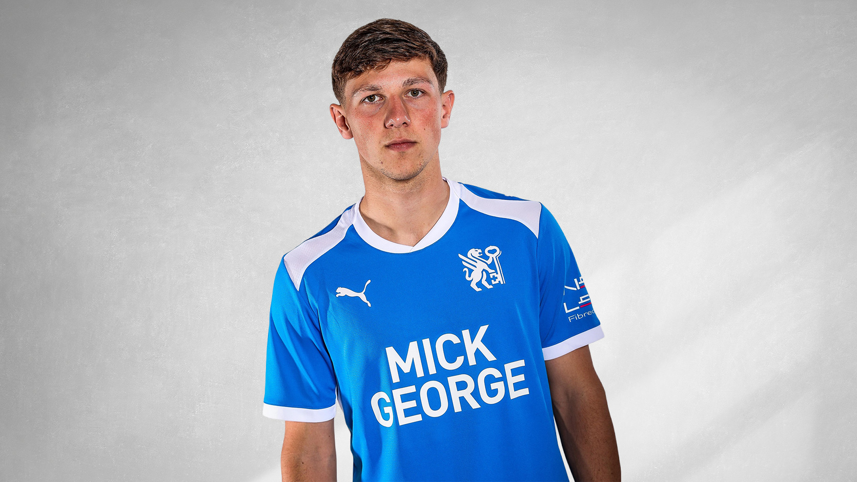
The new Peterborough United jersey is presented in the club’s traditional Royal Blue colourway, combined with white detailing throughout. The shirt features a round ribbed collar in white and matching white sleeve cuffs.
White shoulder panels extend across the upper chest and shoulders, creating contrast against the blue base, while the new Peterborough United crest appears on the left chest opposite the Puma logo.
The front of The Posh's shirt carries the Mick George shirt sponsor in white, with additional partner branding appearing on the sleeves and upper back.

The New Era
A key element of the launch is the introduction of the club’s new visual identity. The campaign, titled “The New Era”, centres on the unveiling of the updated crest and reflects the connection between Peterborough United’s history and its future ambitions.
Technical Features
The shirt incorporates Puma’s modern teamwear construction, with textured white panels and lightweight performance fabric designed for use during competition and training.
As part of Puma’s RE:FIBRE programme, the Peterborough United 2026/27 home shirt is manufactured using at least 95% recycled textile waste and other reused materials.
Full Peterborough United Home Kit details
The new Peterborough United football shirt is paired with matching blue shorts and blue socks featuring white detailing and will be worn throughout the 2026/27 EFL League One season.
Click to enlarge images