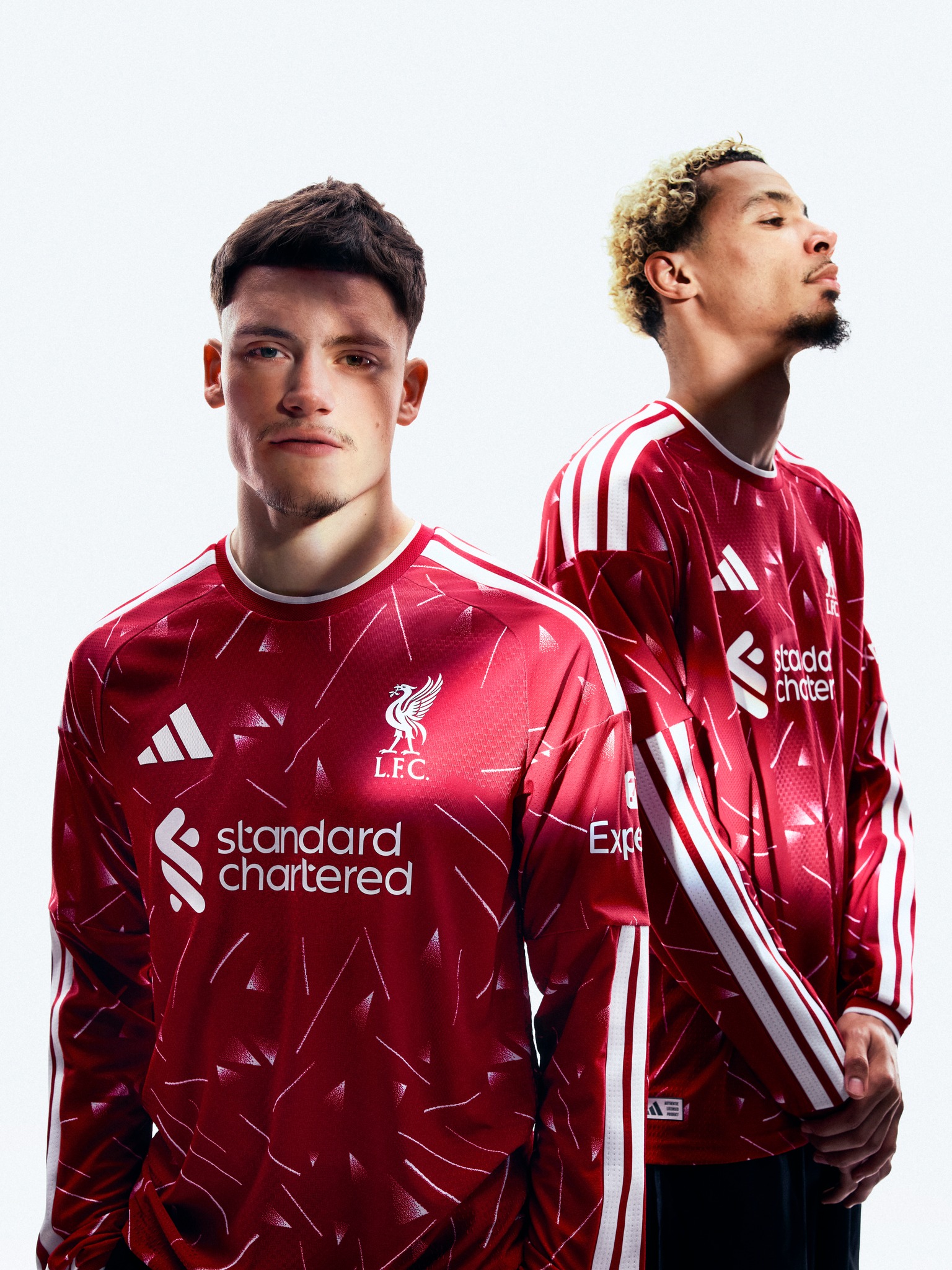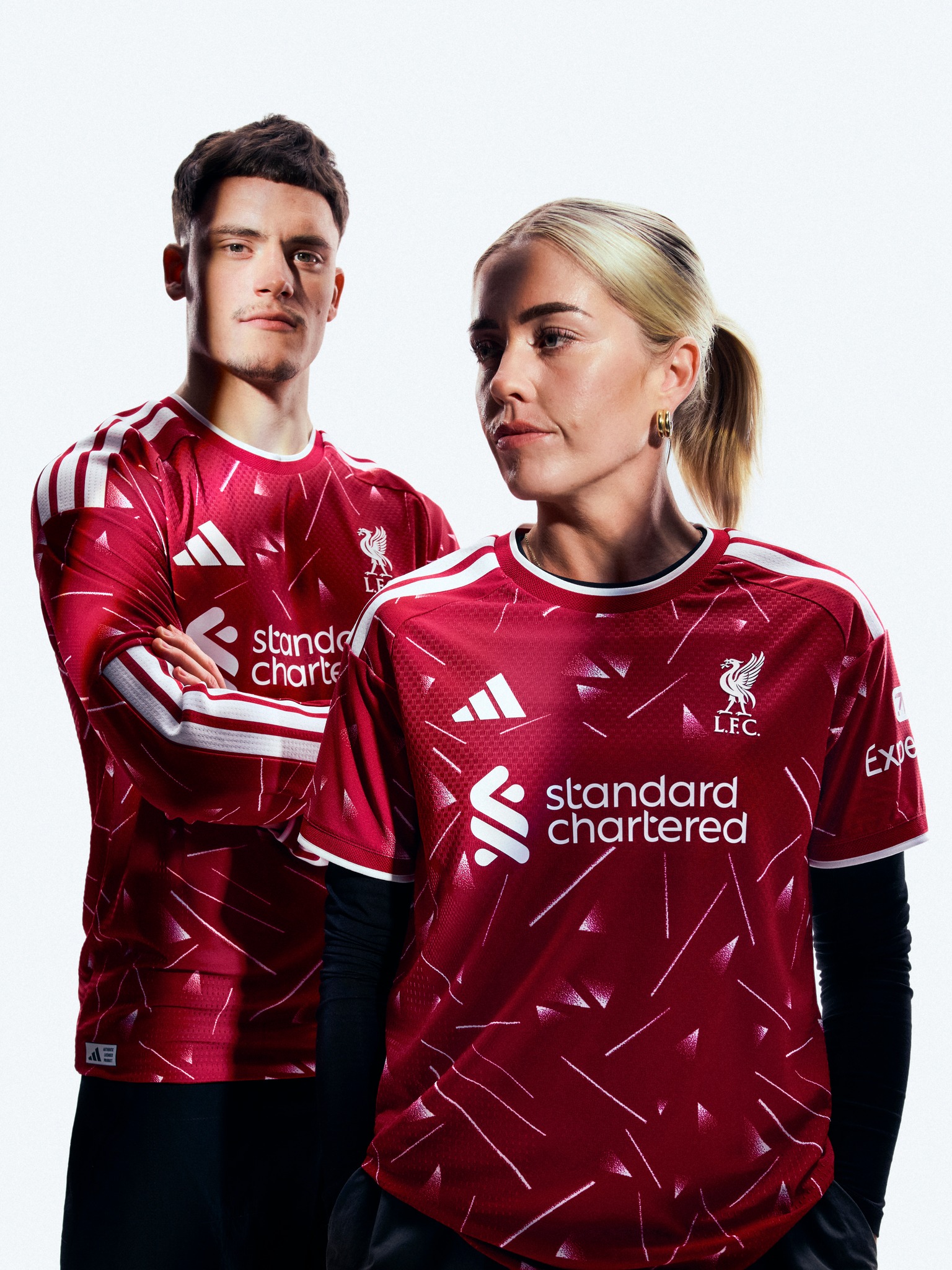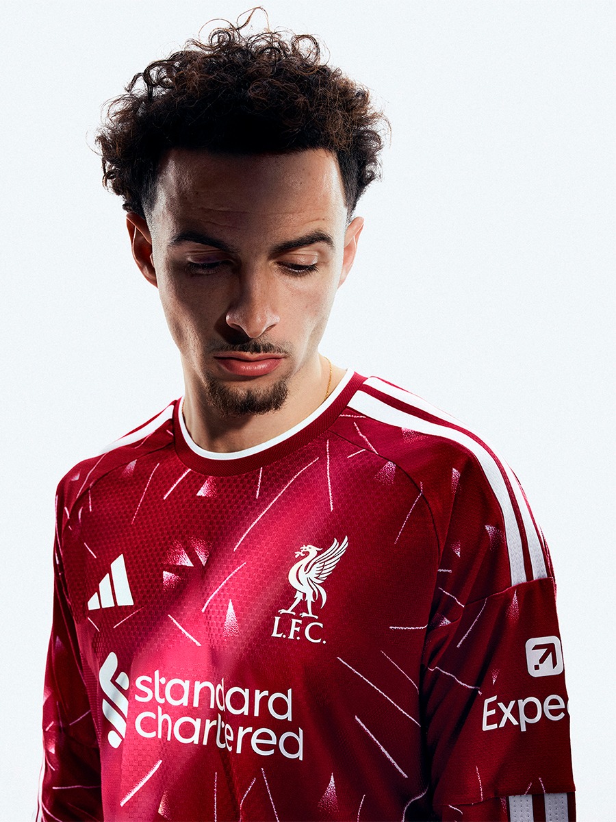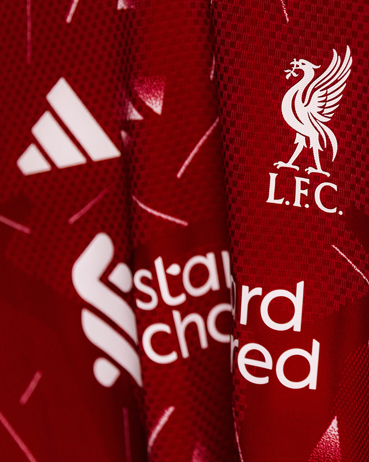
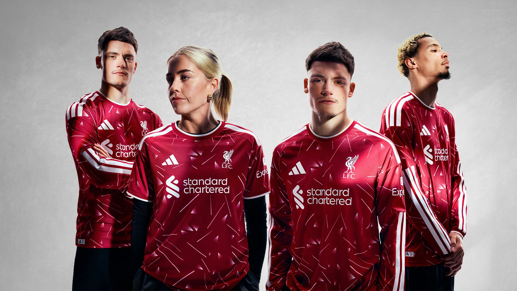
Liverpool and adidas have released the Liverpool 26/27 Home Kit, with the design referencing the club’s home shirt worn during the 1989-90 title-winning season.
Liverpool Kit Design & Inspiration
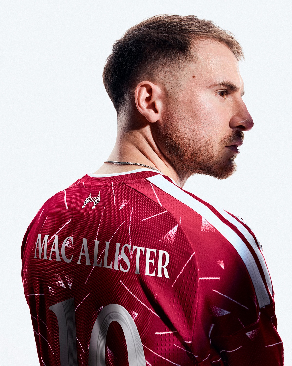
The new Liverpool home shirt uses a deep red (Active Maroon) base with an all-over geometric graphic made up of white line details and triangular forms. The pattern continues across the front, sleeves and back, linking the shirt to the adidas design worn between 1989 and 1991.
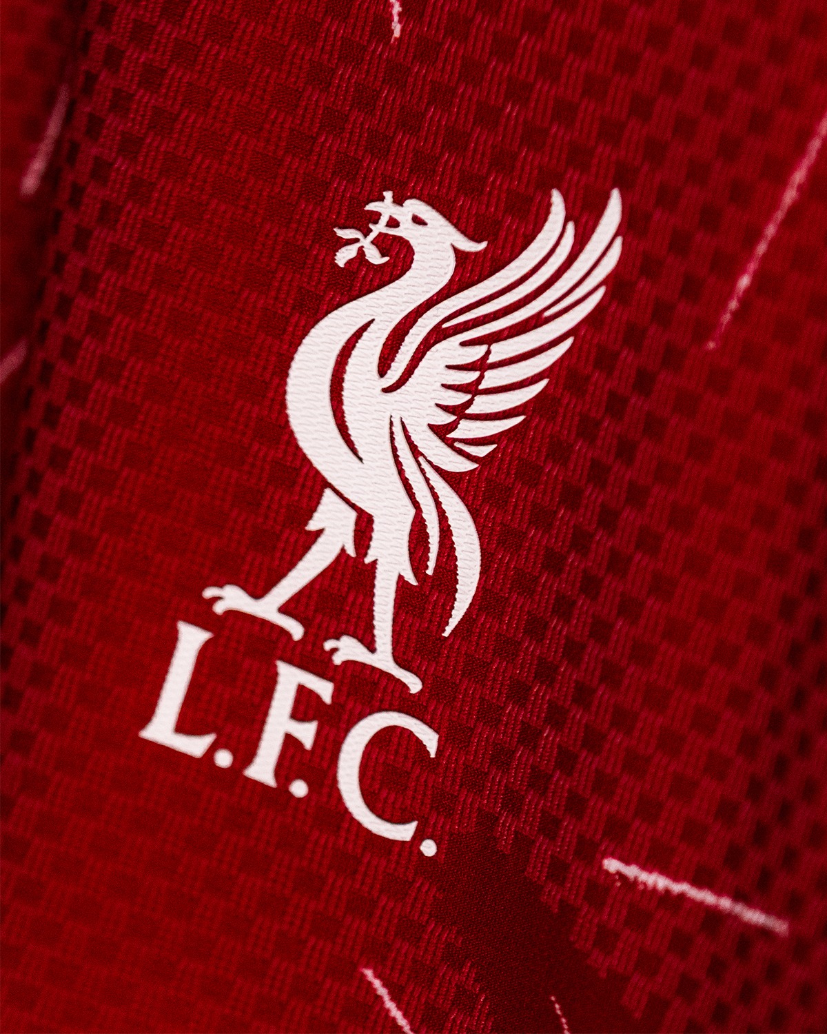
White detailing is used for the adidas logo, Liverpool crest and L.F.C. lettering on the chest. Standard Chartered appears as the main front sponsor, with Expedia placed on the sleeve. White adidas Three Stripes run across the shoulders, while the collar and cuffs are finished with white trim.
Player issue details include body-mapped texture, ventilation zones and an authentic licensed product label near the lower hem. On the upper back, a 97 detail appears below the collar. Liverpool have also introduced a new name and number style, based on the club typeface and linked to the shape of the Liver bird.
Technical Features
The Authentic version delivers a slim, streamlined fit with jacquard fabric and a heat-applied federation badge, enhanced by Climacool+ for cooling and moisture control.
The replica version mirrors the fit in interlock fabric, with Climacool technology designed to keep the wearer cool and dry.
Full Liverpool Home Kit details
The new Liverpool jersey is completed with Active Maroon shorts and socks, creating a full match strip for the 2026-27 Premier League season and European fixtures. A goalkeeper kit has also been launched with the same graphic direction, using a green colourway connected to the late 1980s and early 1990s period.
View the: Liverpool 26/27 Away Kit
View the: Liverpool 26/27 Third Kit
Click to enlarge images