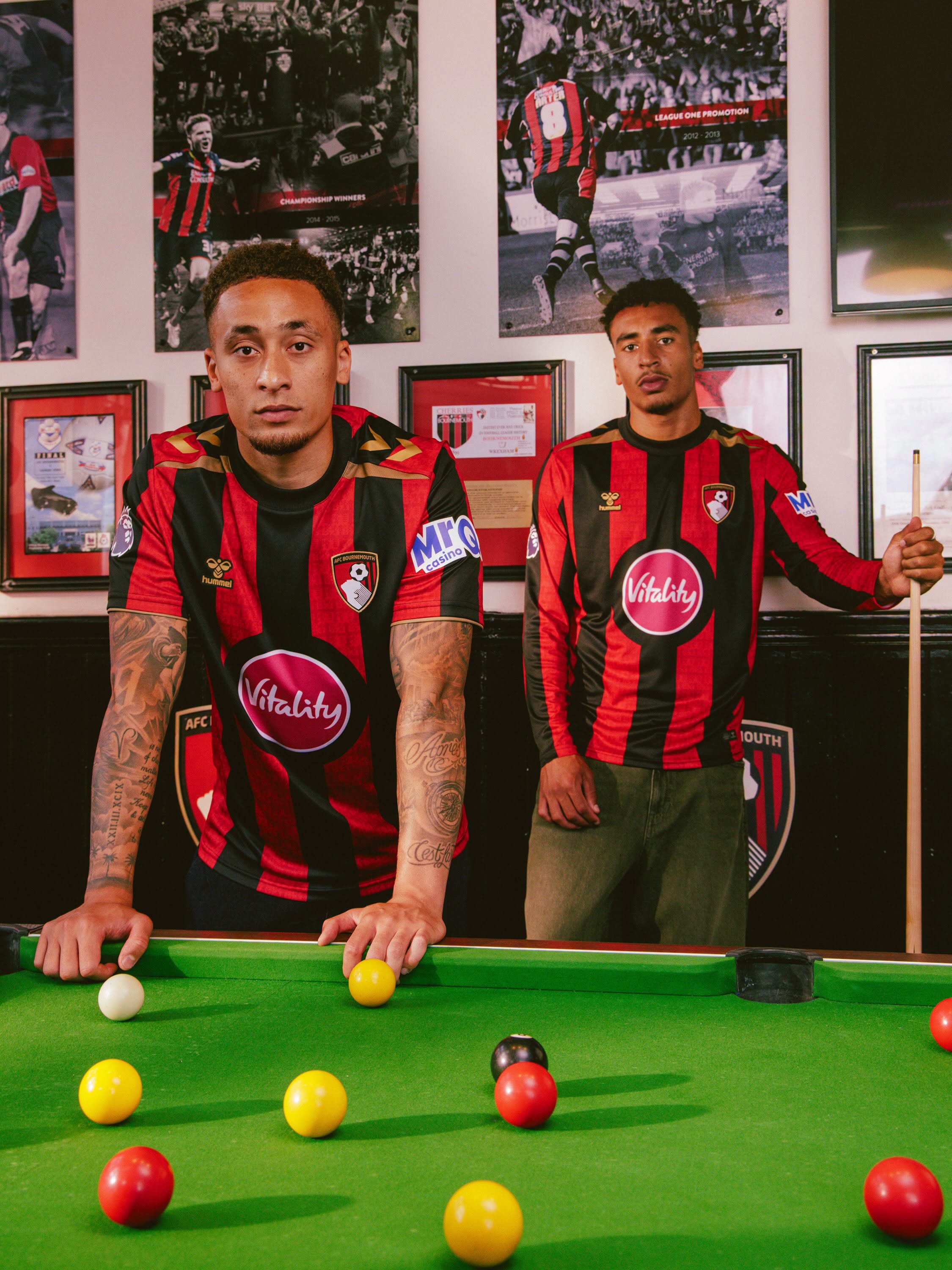
AFC Bournemouth have unveiled their 26/27 Home kit, the first release under the club’s new partnership with hummel, ahead of the 2026–27 Premier League season.
Bournemouth Kit Design & Inspiration
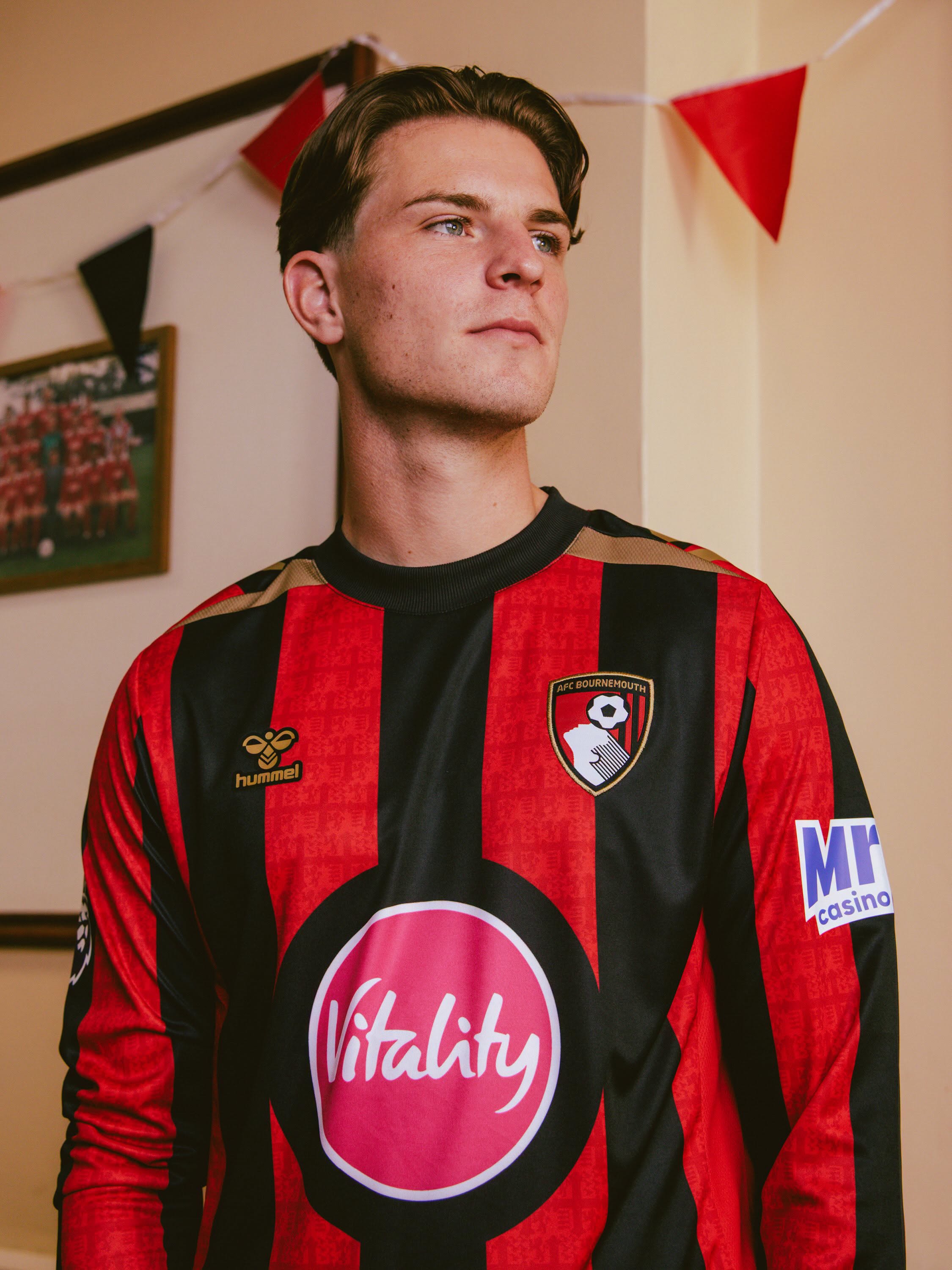
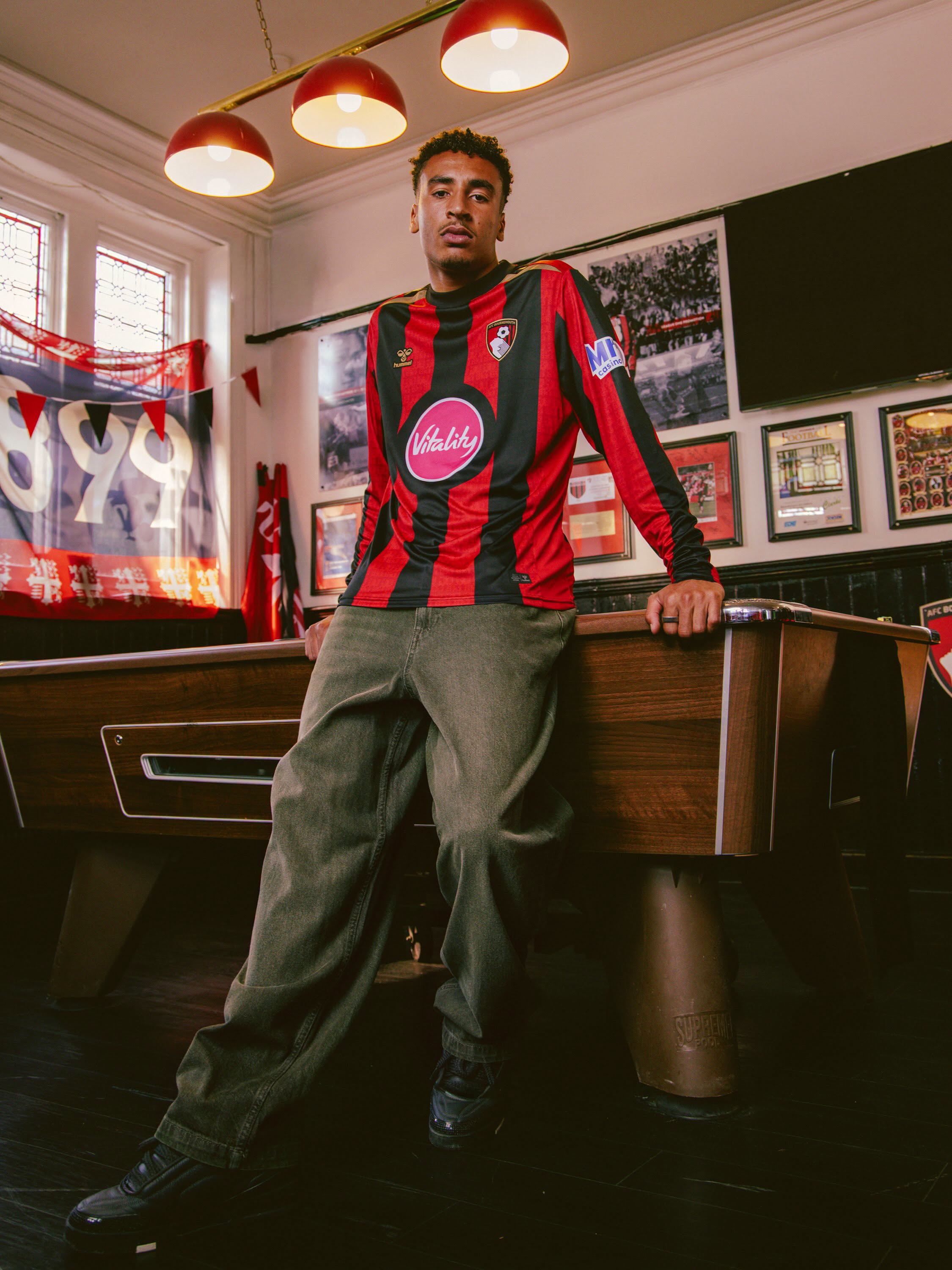
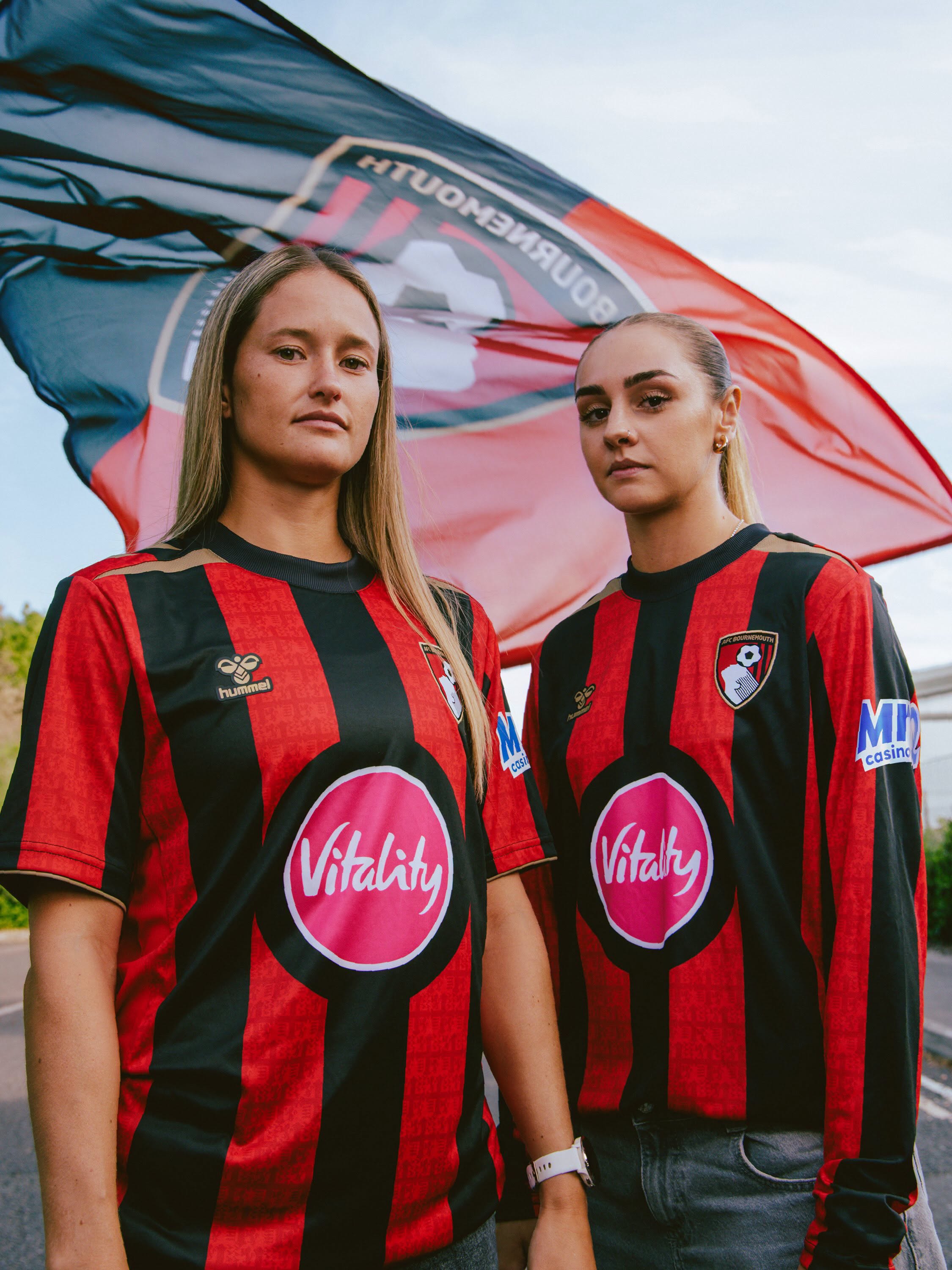
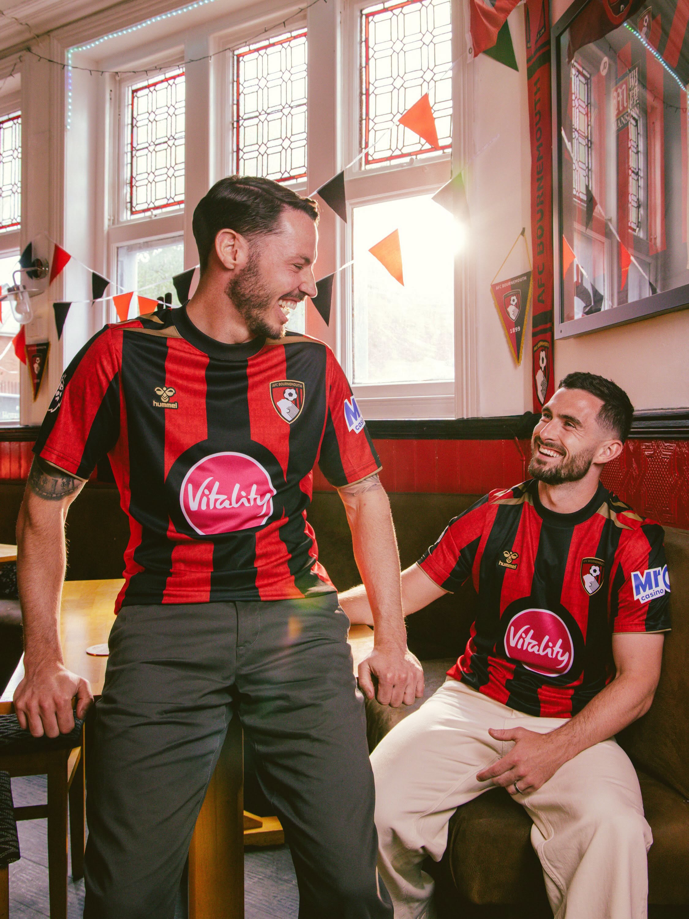
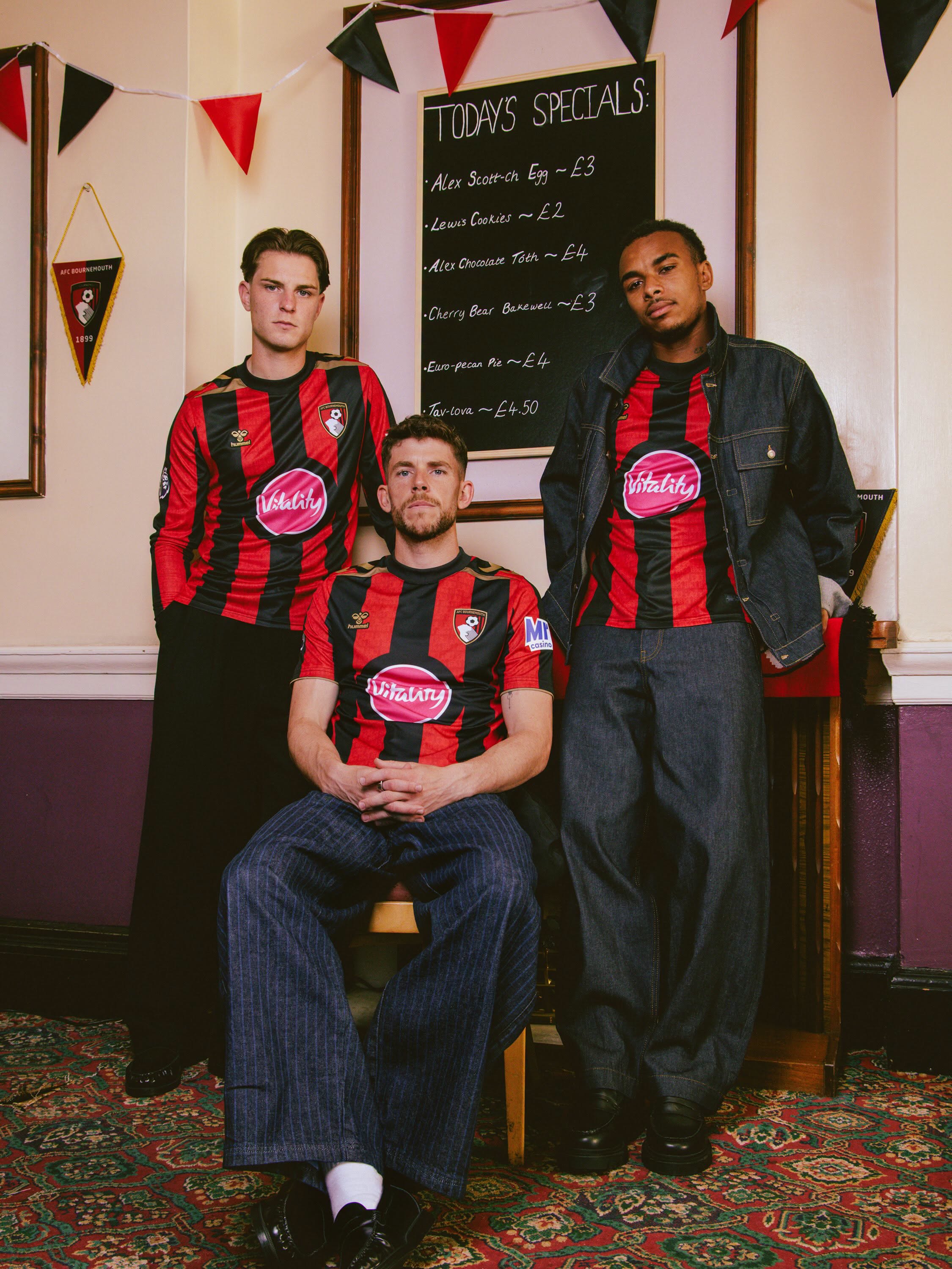
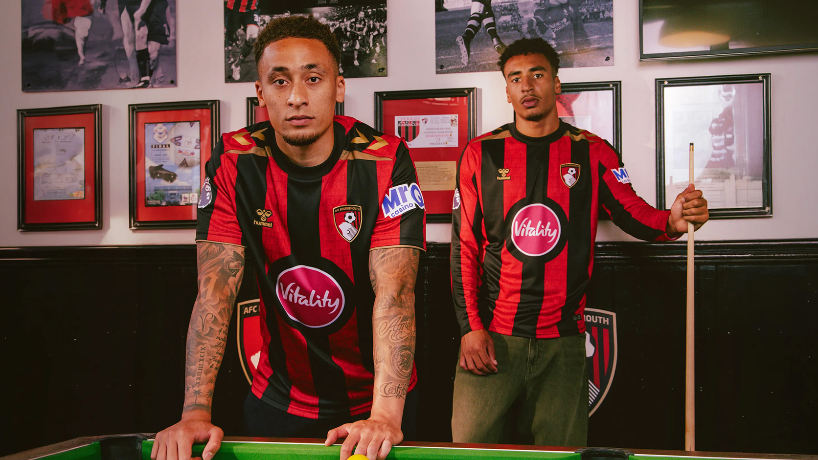
The new Bournemouth jersey returns to wider red and black vertical stripes across the front, sleeves and back. A tonal pattern based on the club’s original 1936 crest is incorporated into the red sections, with a gold version of the historic emblem positioned beneath the back collar.
Gold detailing continues through the hummel logo on the right chest, the trim around the Bournemouth crest and the chevrons placed across the shoulders. A black ribbed crew neck completes the neckline, with gold inserts running from the collar towards the sleeves.
Bournemouth Shirt Sponsors
Vitality appears as the principal shirt sponsor in the centre of the jersey, following an expansion of the company’s long-standing partnership with the club. MrQ Casino branding is applied to the sleeve.

Technical Features
The shirt is made from lightweight 140gsm knitted interlock fabric using 100 per cent polyester. Its moisture-wicking construction supports comfort, breathability and freedom of movement, with mesh panels positioned along the sides to improve airflow and help reduce overheating.
Additional details include a woven club crest, raised silicone hummel branding and branded elasticated tape inside the back neck.
Full Bournemouth Home Kit details
The new Bournemouth football shirt is paired with black shorts featuring the club crest and gold hummel branding, with gold chevrons positioned on the outer legs. Black socks complete the full 2026/27 Home kit, finished with red cuffs and toe sections, narrow gold trim and gold hummel chevrons on the front.
View the: Bournemouth 26/27 Away Kit
Click to enlarge images