Birmingham City 2022-23 Nike Away Kit

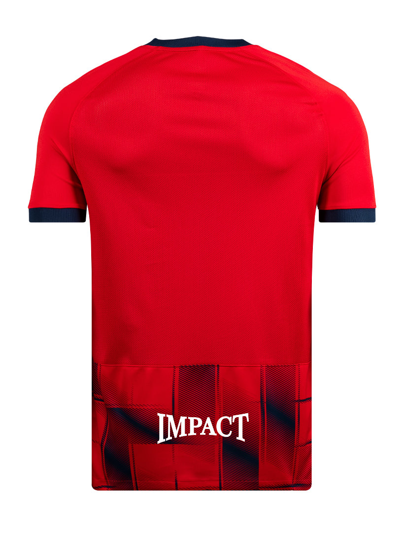
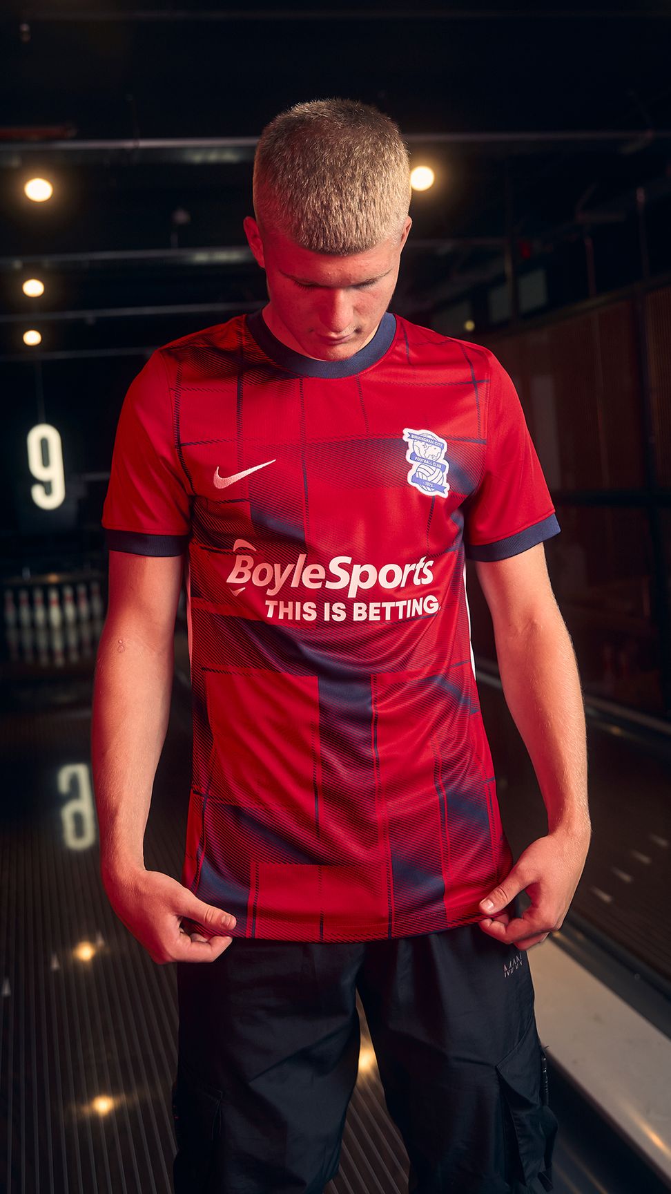
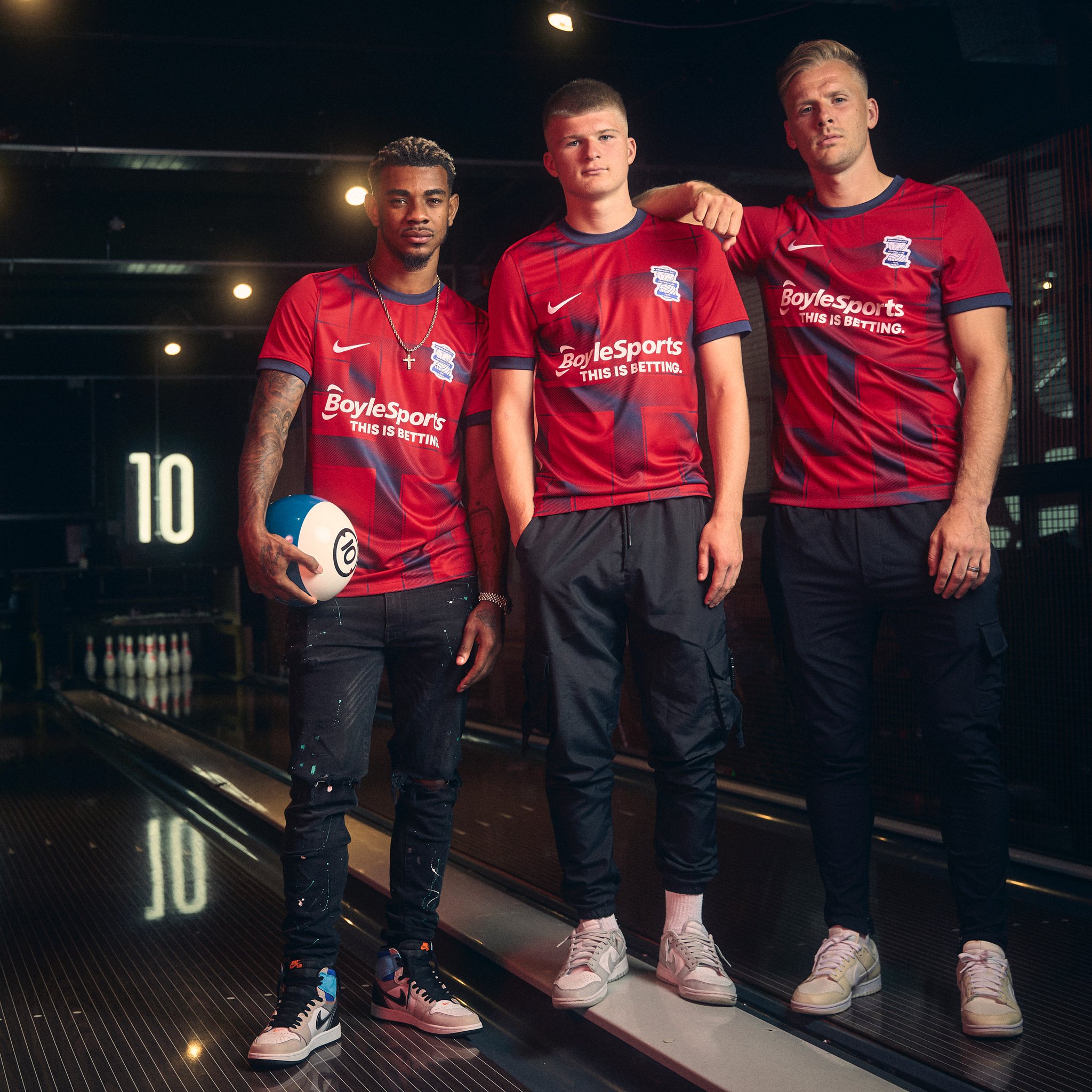
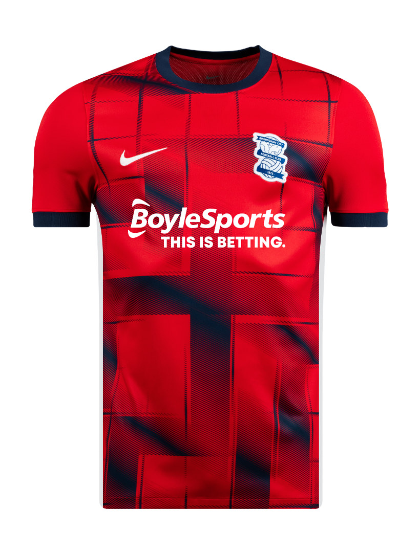
This is the new Birmingham City Away kit for the 22/23 season.

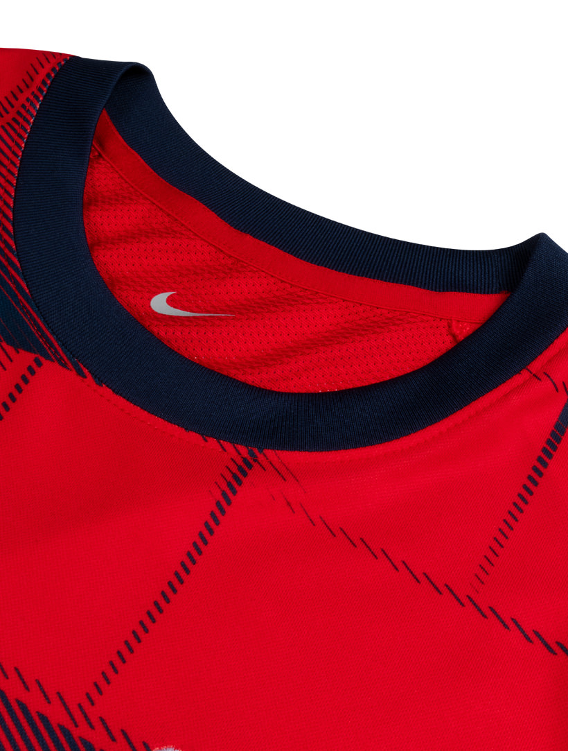
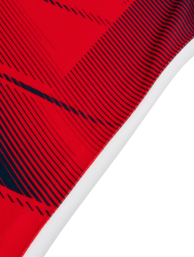
Following on from last year’s throwback design, the Club’s latest release in association with the world’s leading footwear and apparel company is a nod to alternative strips worn during the mid-1990s, with a powerful red complemented by a navy neck and sleeve trim that runs into a graphic pattern across the front and lower back panels.

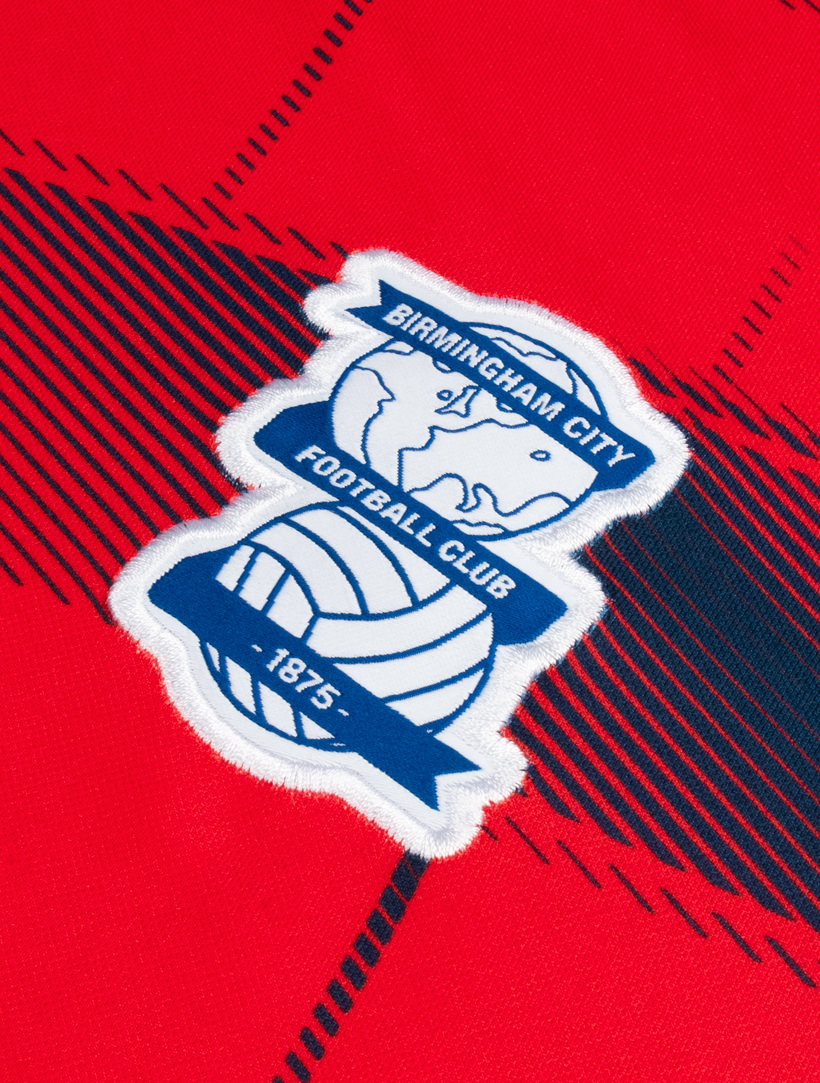
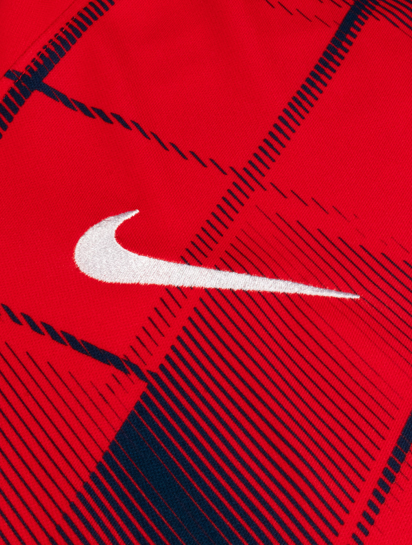
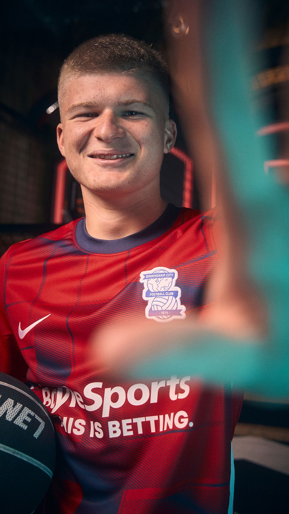
The jersey also features a woven production of Birmingham City's iconic globe and ball crest, complete alongside the Nike swoosh in a white colourway that is replicated on a side panel that continues onto red shorts, before navy socks sign off a fitting ensemble.

Men’s shirts will display the logo of Principal Partner BoyleSports, with both the Women’s and RTC jerseys displaying the identity of Club Partner IMPACT, who will also be on the Men's back of shirt.

Classic Kits

View the: Birmingham City 2022-23 Home Kit
 

3.0
12 reviews
Vote now!
  • 5
  • 5
  • 6
  • 9
  • 2
  • 8
  • 19
WBA Fan
 · 3 years ago
Show more
 · 4 years ago
Show more
 · 4 years ago
Show more
 · 4 years ago
Show more
Andyk
 · 4 years ago
Comment (Not Required)
This is really nice. Normally bfc have had really boring kita over the uears just the odd one or two that have been nice. This one really stands out. Even i would buy this and im a wba fan.
Show more
Matt
 · 4 years ago
Comment (Not Required)
Who the hell gave that design the go ahead?
Could they not see it? Shameful.
Show more
  • Jc 4 years ago
    Why is it shameful get a grip .
    • Jc 4 years ago
      @Matt But it’s not a swastika is it?.
    • Matt 4 years ago
      Because the front features symbolism connected to hate, despair and suffering. That's why it is shameful.
dimisfinesthour
  • Member
  • 1641
  • 7
 · 4 years ago
Show more
 · 4 years ago
Show more
Laouen
 · 4 years ago
Show more
 · 4 years ago
Show more