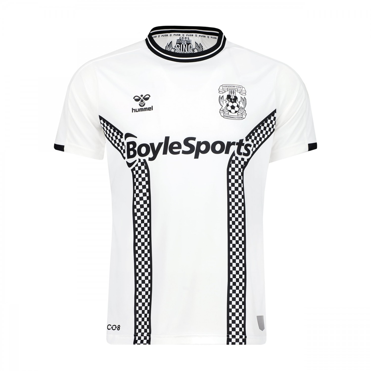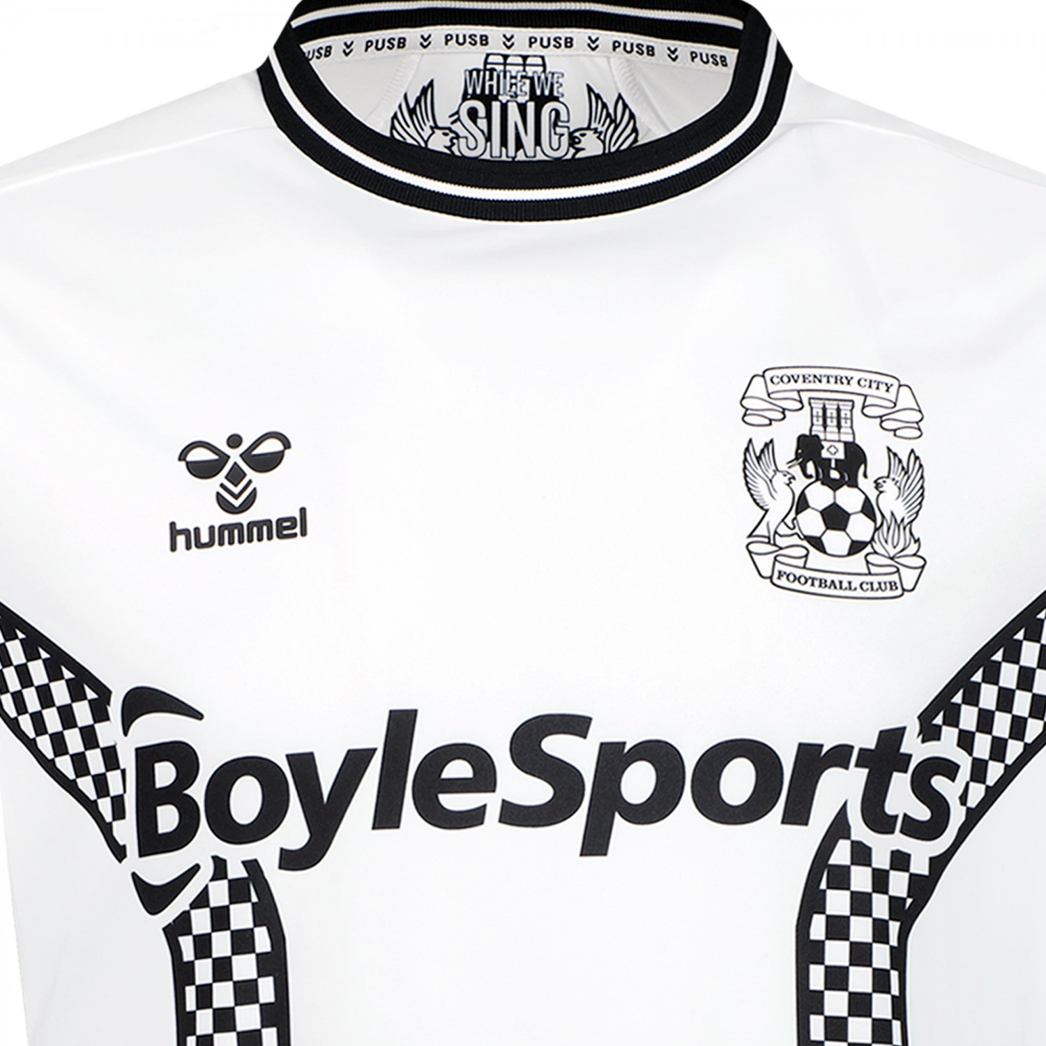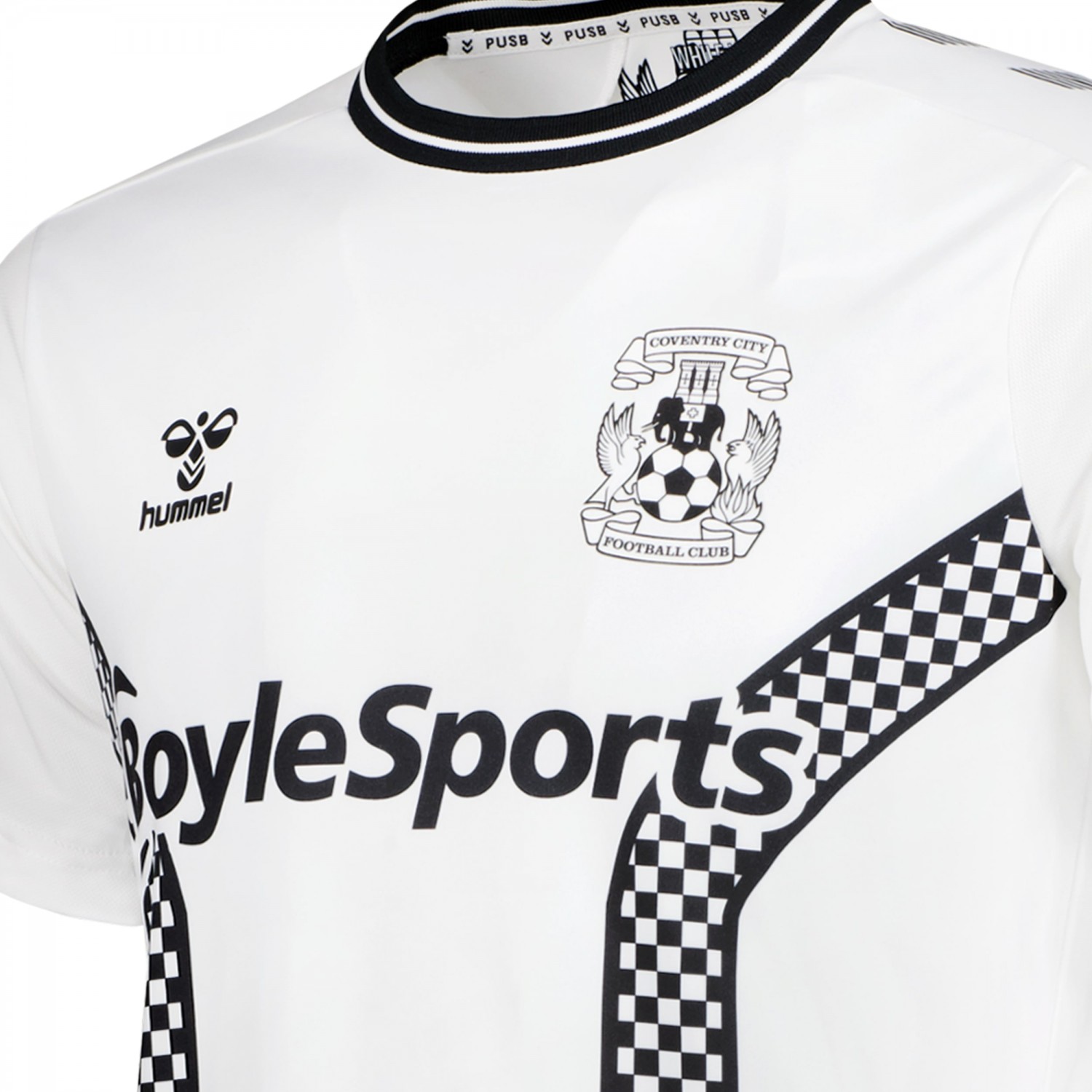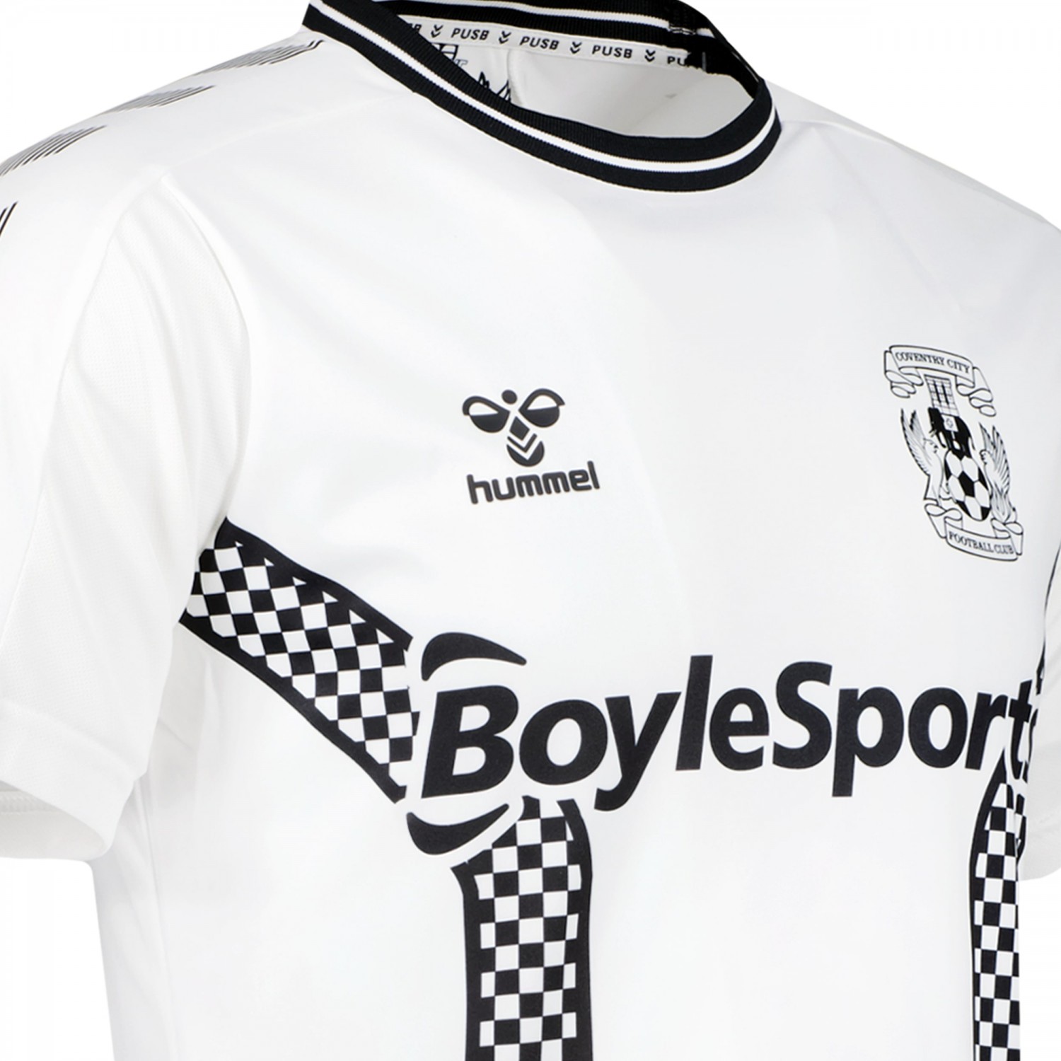
Coventry City have unveiled the new Third Kit for the 21/22 season.
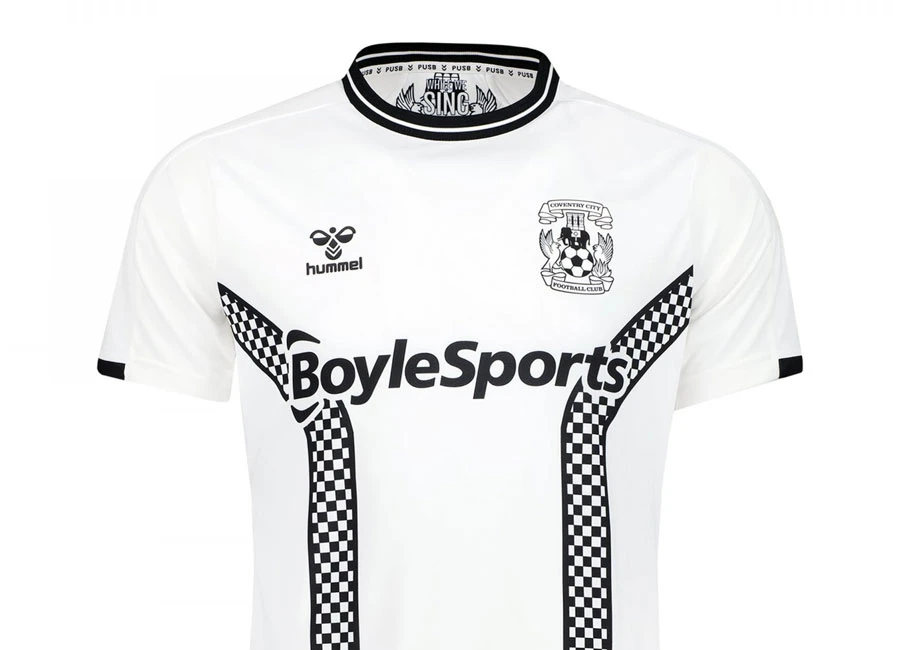
The new Hummel kit is in a 2 Tone theme, in recognition of the musical and cultural influence of the movement on the City and Coventry being UK City of Culture, and returning to a hugely popular theme from the 2019/20 campaign.
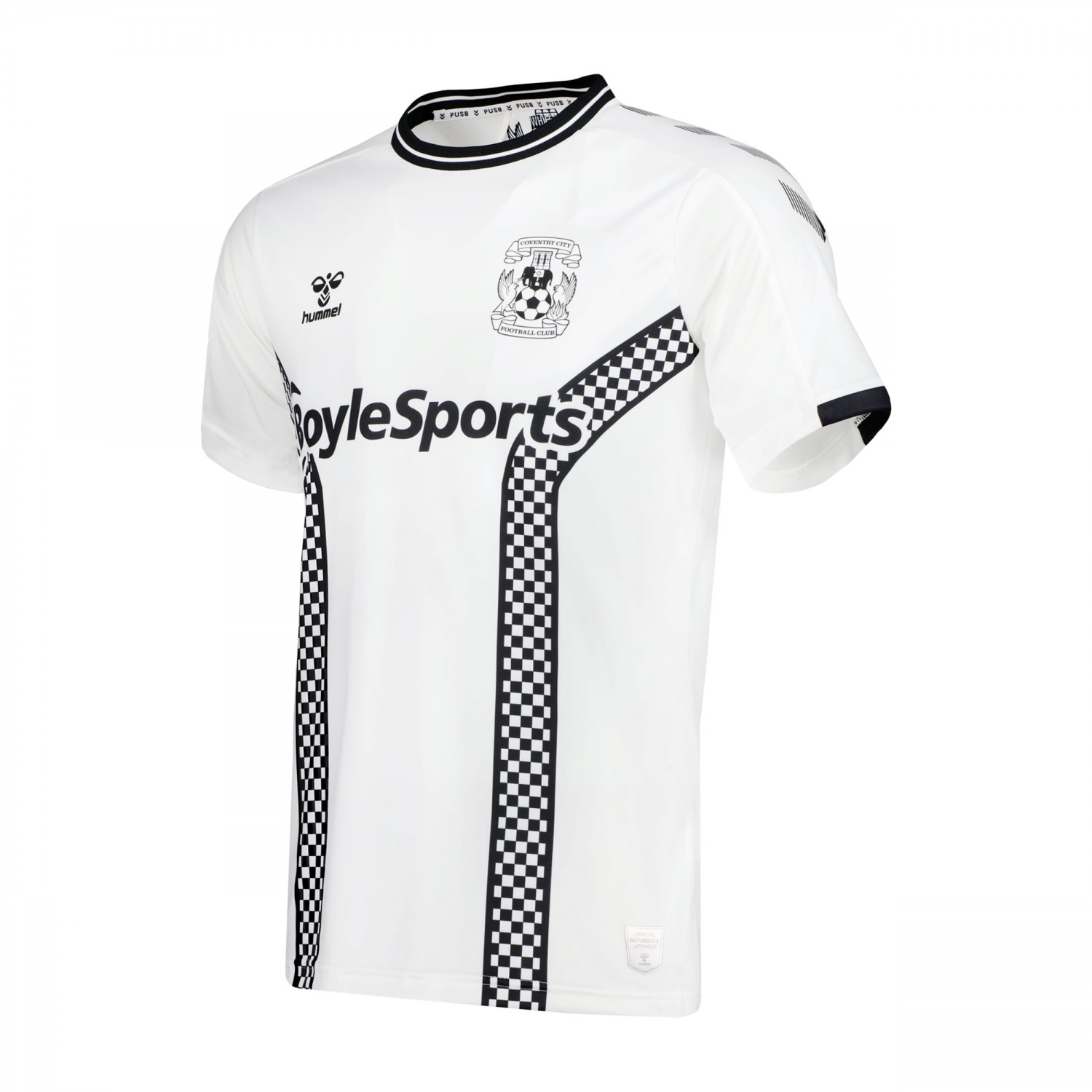
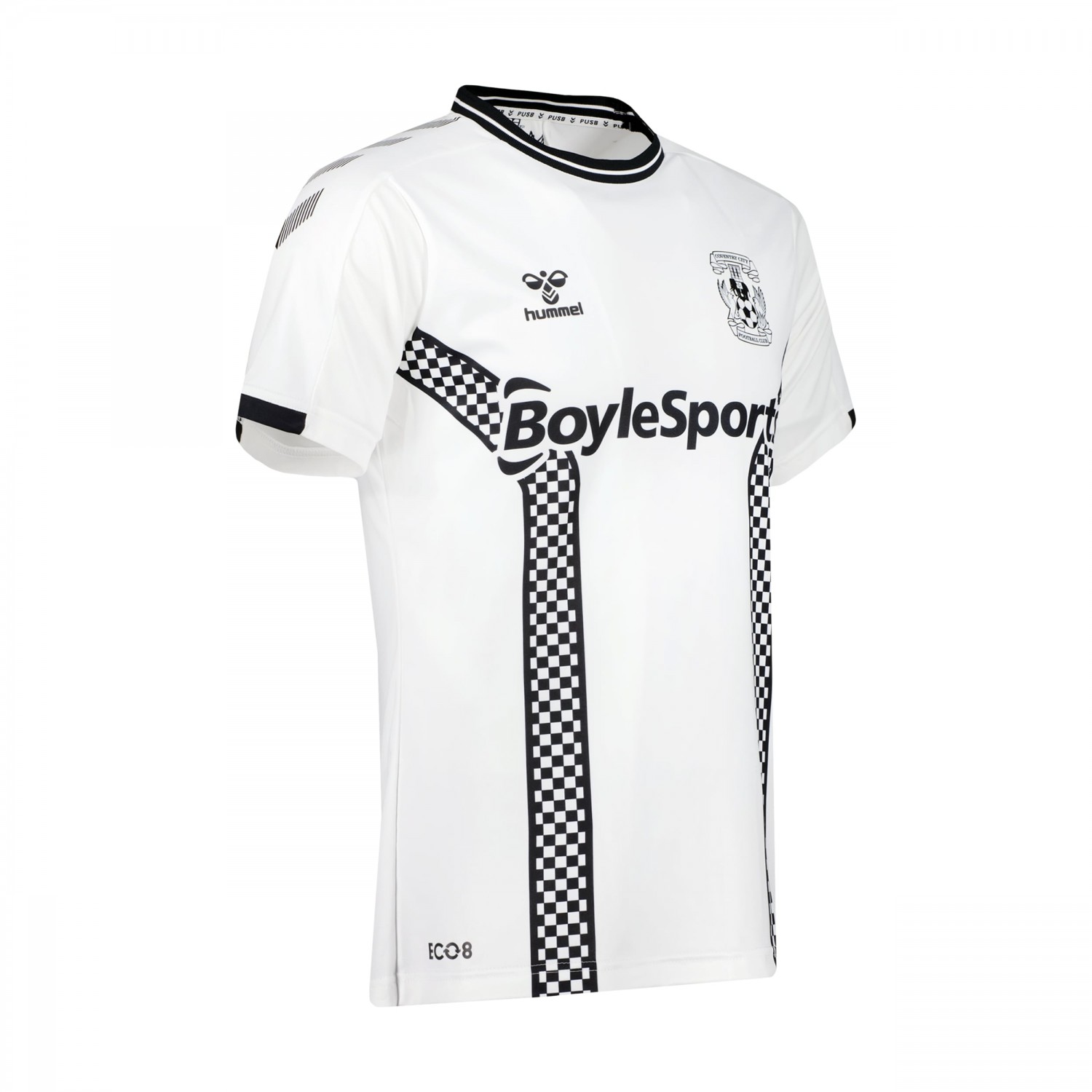
The bespoke, new 2 Tone kit incorporates the famous ‘tramlines’ which featured in Coventry City kits in the late 1970s – including in 1979, when The Specials released their first LP – but now with the distinctive checkerboard design closely associated with the 2 Tone era.
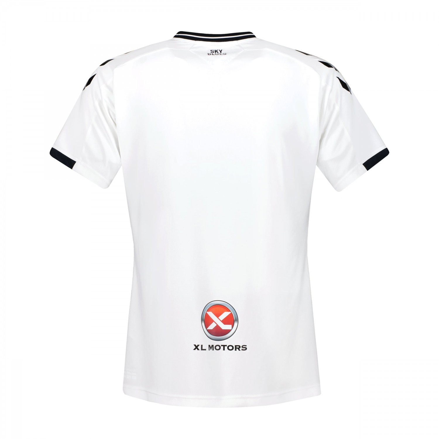
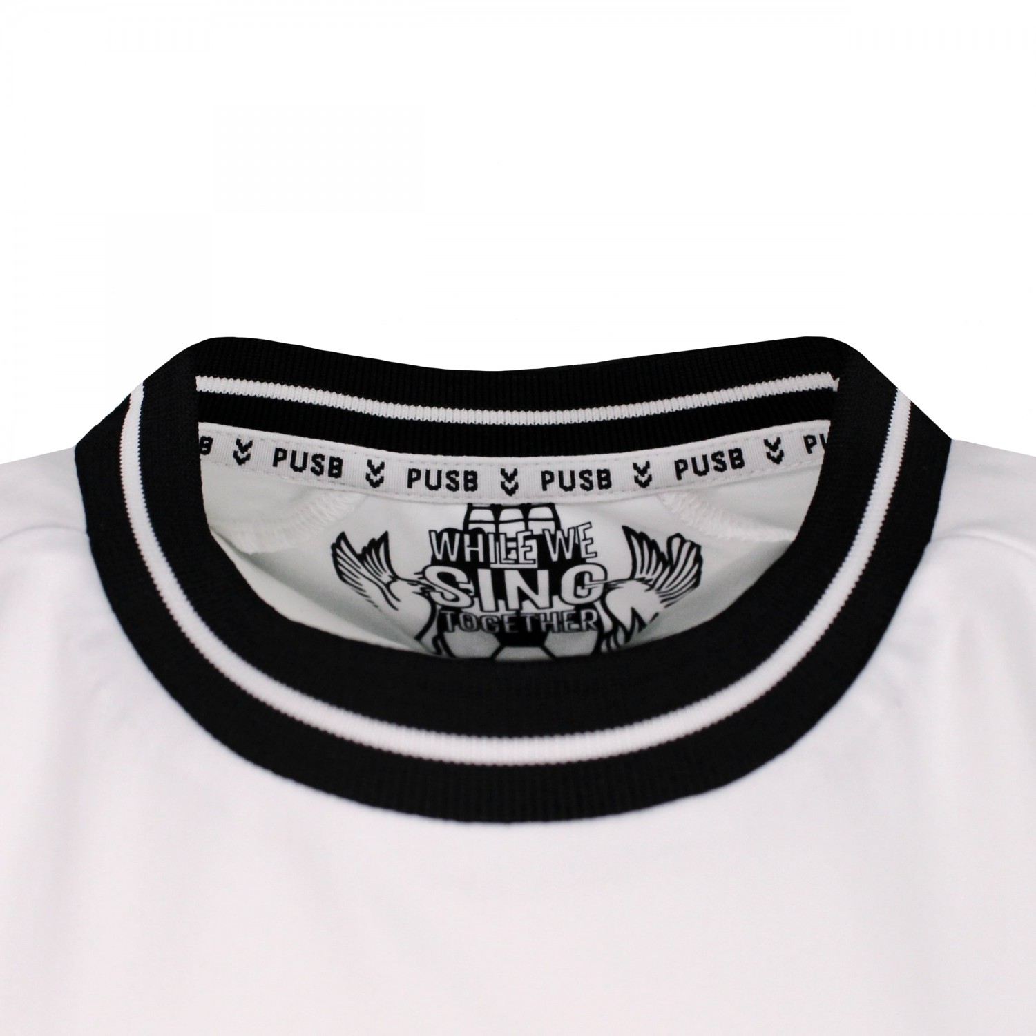
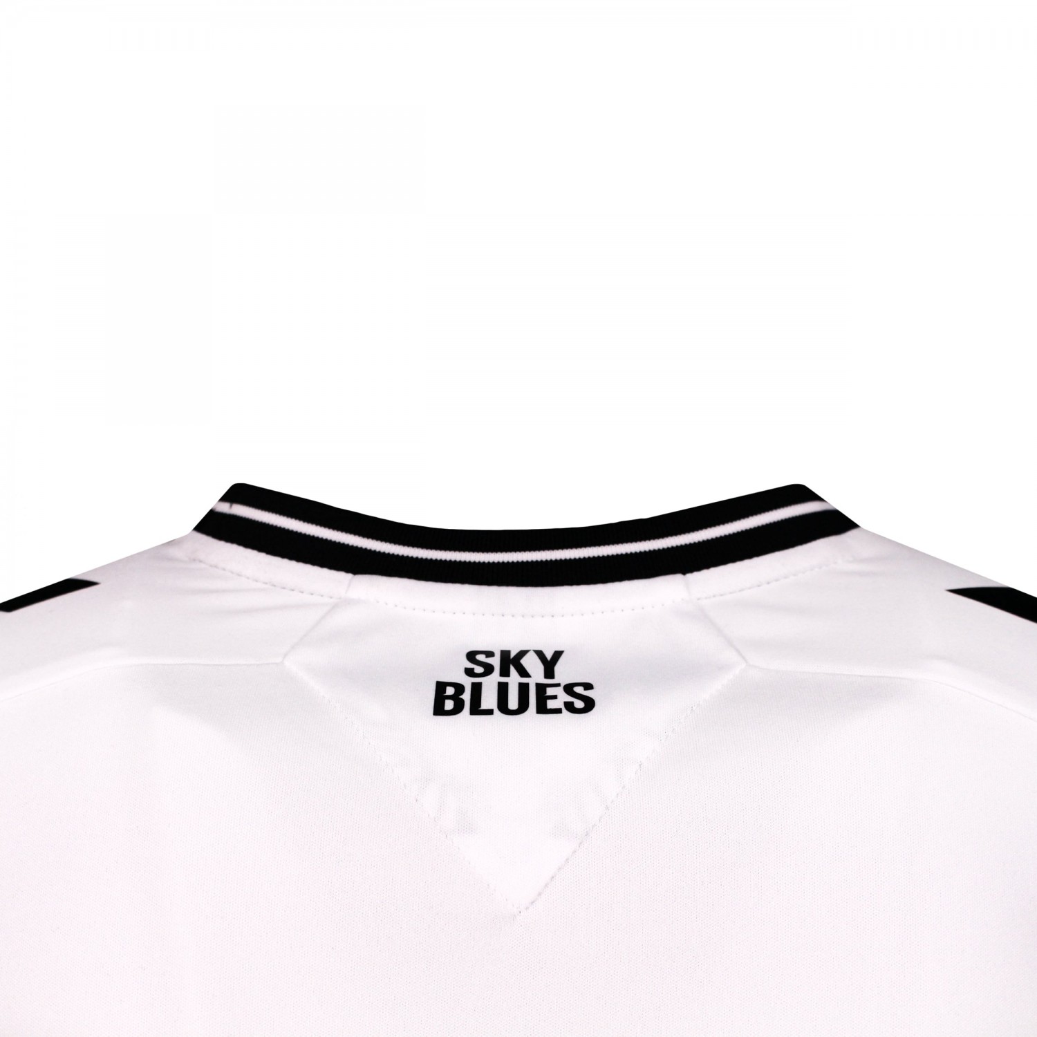
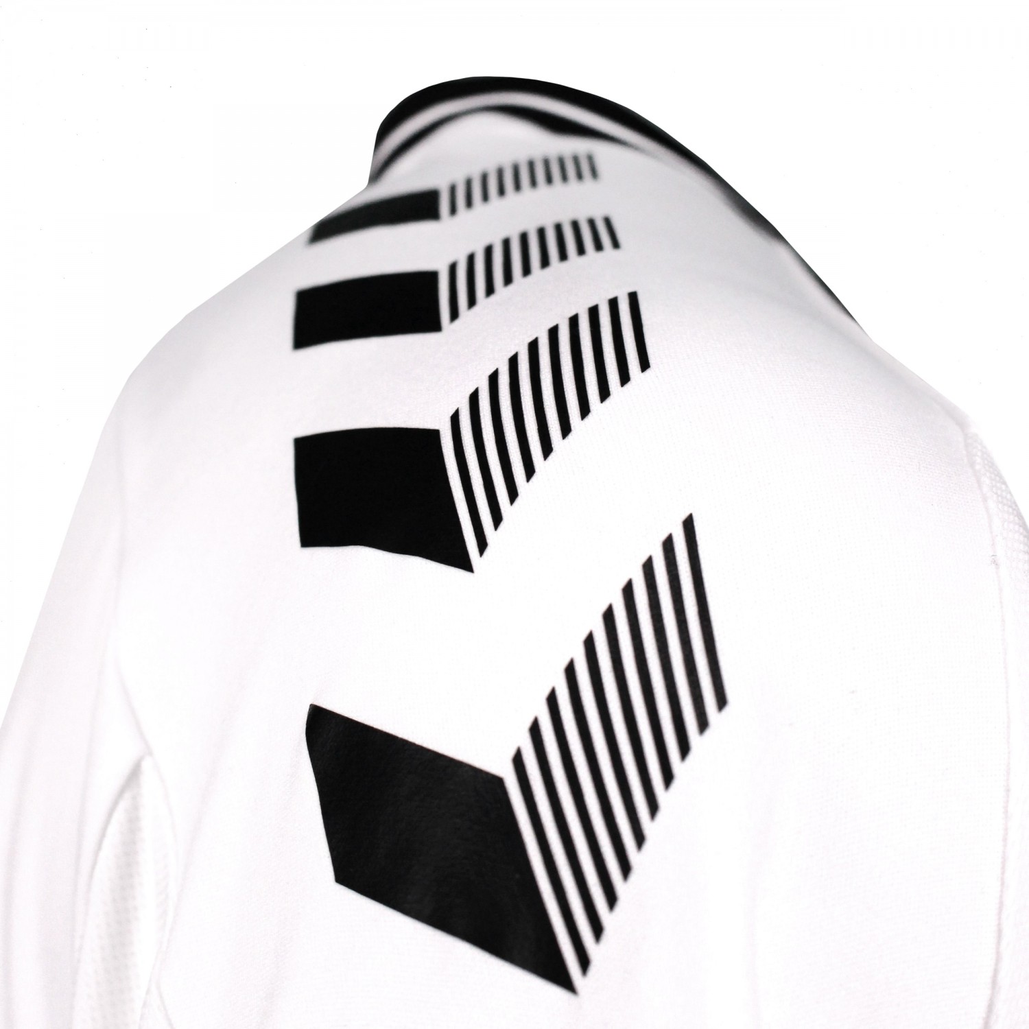
The Hummel shoulder chevrons are black, while the black and white monotone Coventry City crest is on the chest alongside the Hummel logo. Meanwhile, ‘Sky Blues’ is on the rear of the shirt and the words ‘While We Sing Together’ are shown on the in the inside of the shirt.

Coventry City’s sponsor BoyleSports is on the front of the shirt too and is in keeping with the overall design of the kit. The BoyleSports logo will be on all retail shirts, except for Junior and Infant sizes. The XL Motors logo is shown on the rear of the shirt too.
The 2 Tone tramline pattern continues on the front of the shorts, while the G&R Scaffolding logo is displayed on the back of these too.
Coventry City’s kits this year use hummel’s ECO8 technology, meaning each shirt is manufactured from high-performing polyester produced from up to eight recycled plastic bottles.