Galatasaray 2020-21 Nike Home Shirt

Galatasaray 2020-21 Nike Home Shirt #Galatasaray #GalatasaraySK #nikefootball

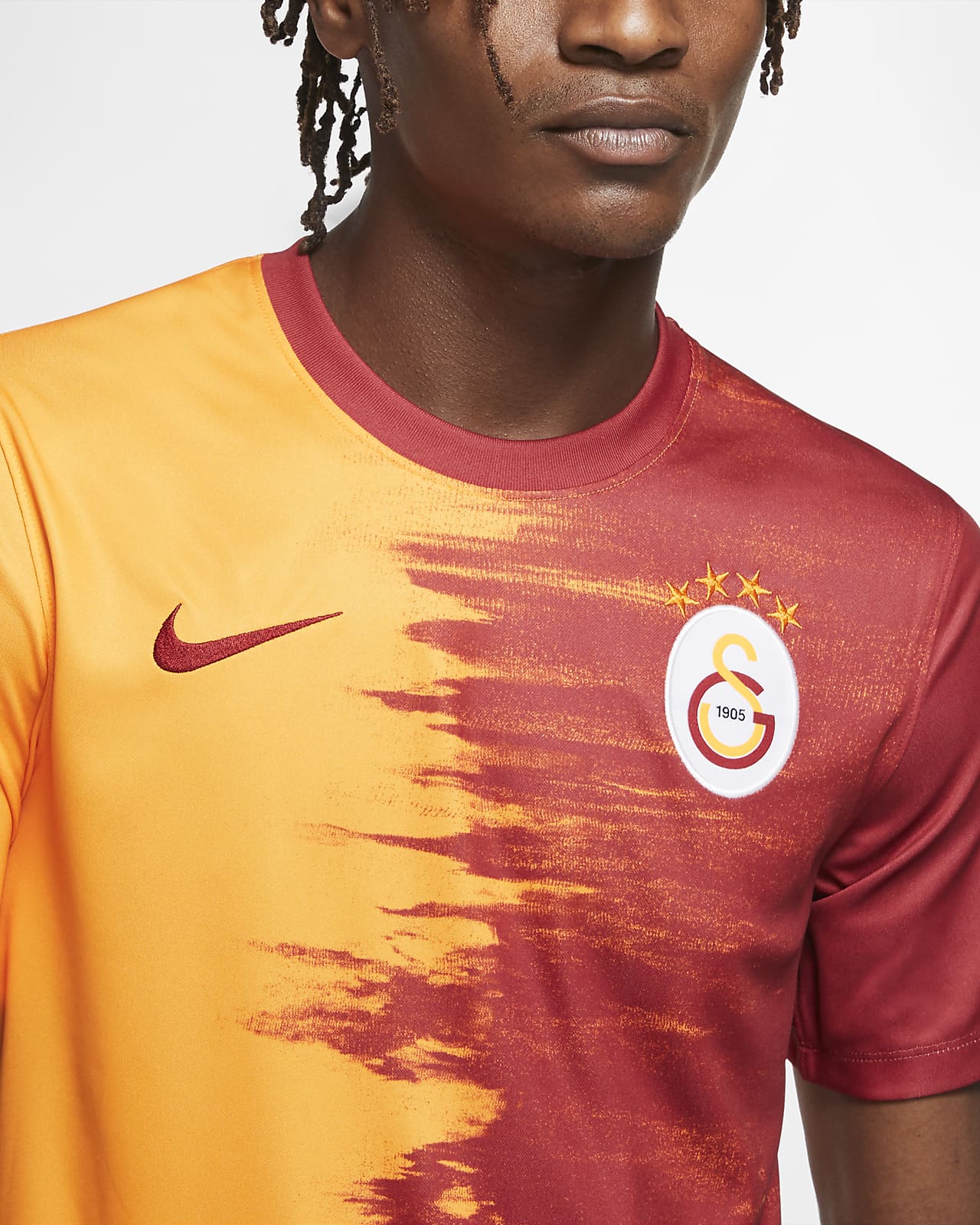
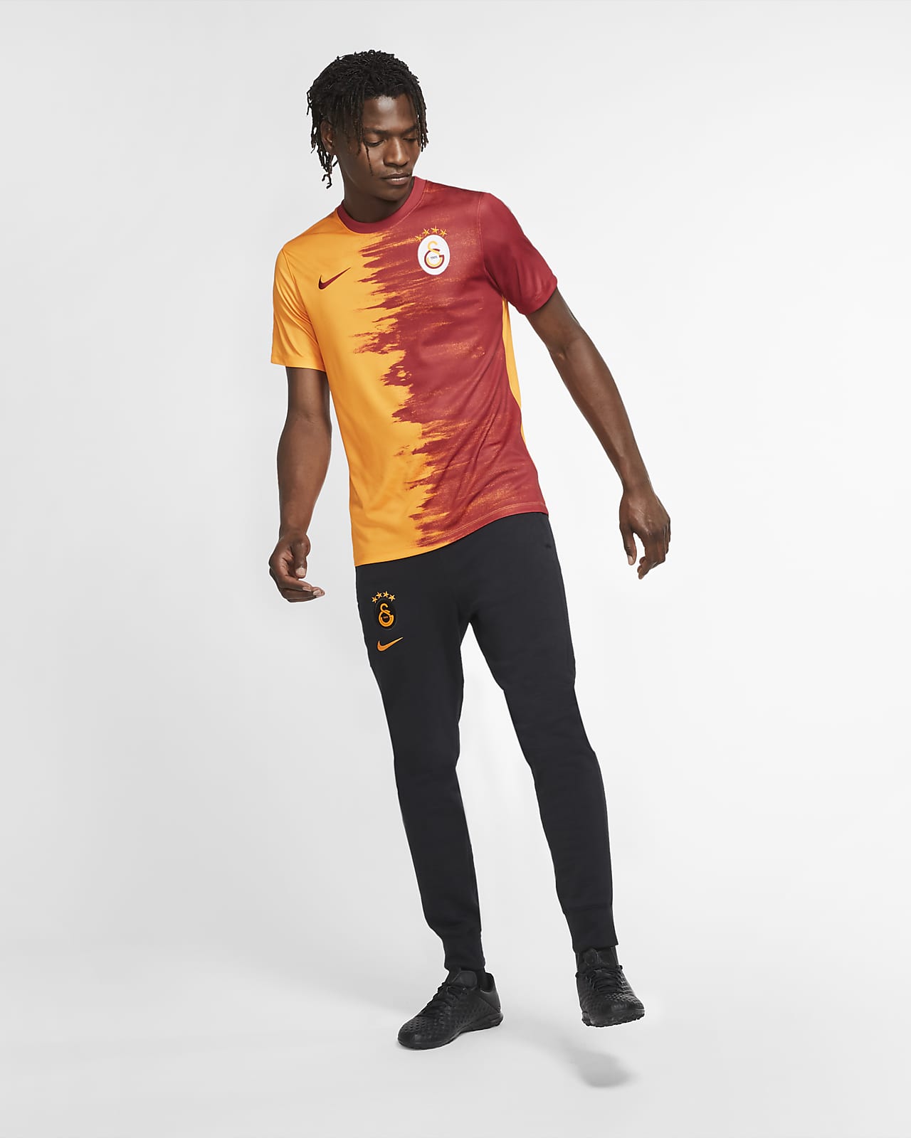
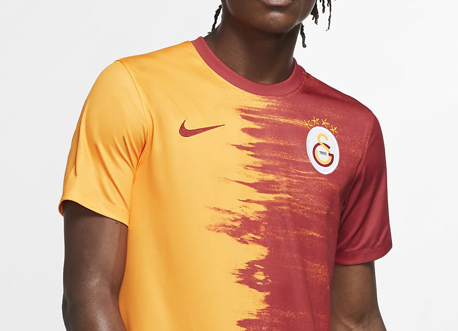
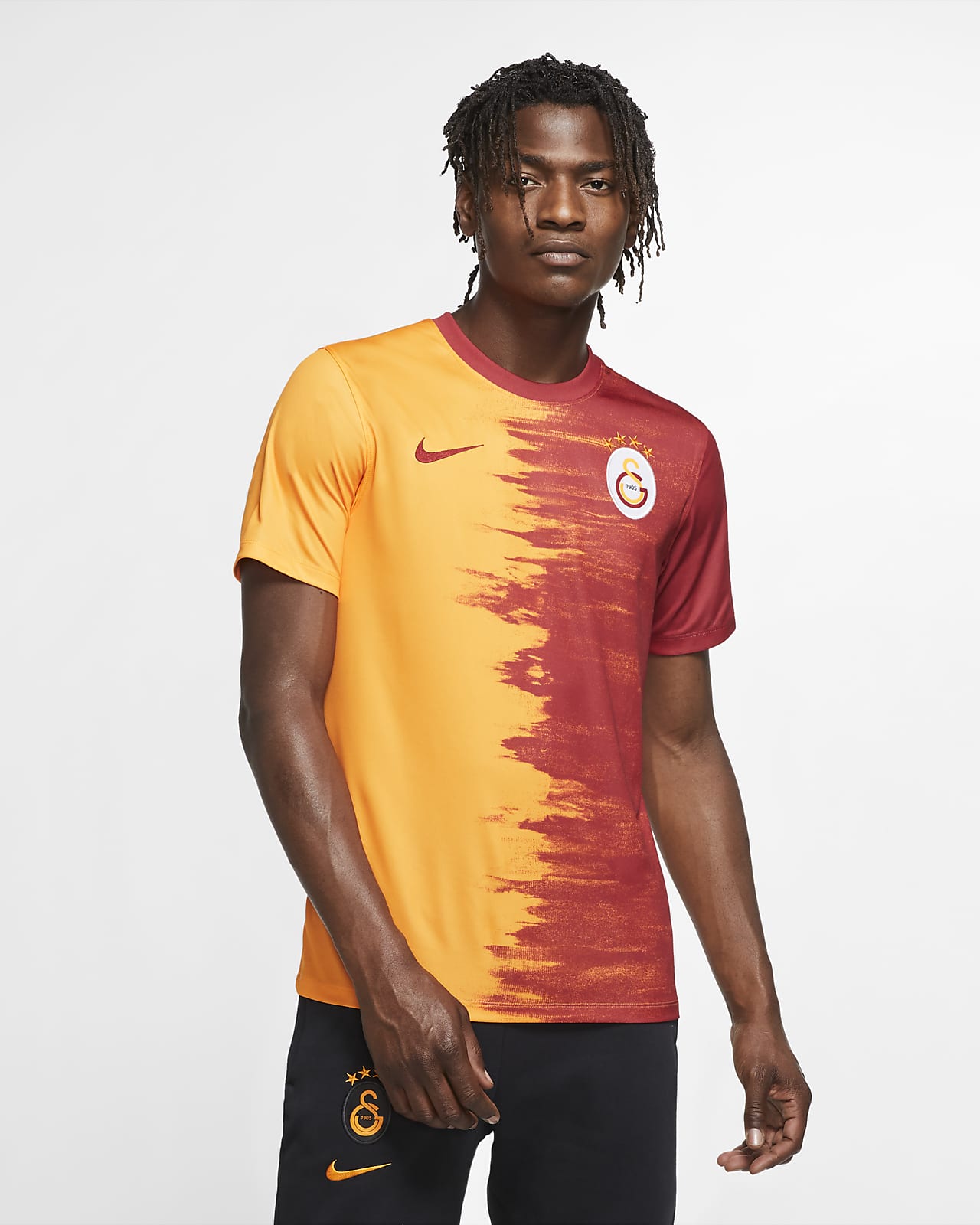
The 2020-21 Home shirt for Turkish Süper Lig giants Galatasaray has been released by Nike.

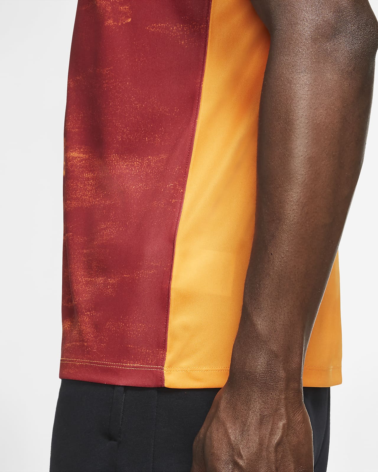
The shirt, in the orange/gold and red halves - this time in the paint brush stroke style being used by all the major manufacturers - sees the Nike Swoosh appear on the golden side in red, matching, on the basic version, a red crew neck.

Buy Now

The Istanbul side has their crest in full colour on the chest, with red shorts and socks to complete the look.

Classic Kits

View the: Galatasaray 2020-21 Away Shirt

{minipolls id="galatasaray2020homejersey" title="What do you think?"} Masterpiece|| Good|| Above average|| average / Nothing special|| Below average|| Bad|| Hall of shame {/minipolls}
 

Write comments...
You are a guest ( Sign Up ? )
or post as a guest
Loading comment... The comment will be refreshed after 00:00.
  • This commment is unpublished.
    · 6 years ago
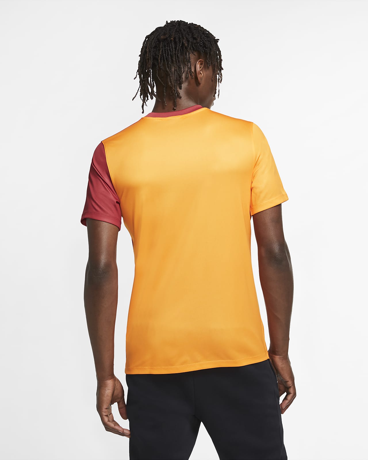
    The back looks completely wrong with just one sleeve a different colour
  • This commment is unpublished.
    · 6 years ago
    I knew I've seen that somewhere before:
    https://www.behance.net/gallery/77950803/Hand-Sketches-%281992-2000%29
  • This commment is unpublished.
    · 6 years ago
    What is so hard about just showing footballers wearing the full kit these days? Why has it got to be a model wearing he shirt with tracksuit bottoms?
  • This commment is unpublished.
    · 6 years ago
    I like this, shame it couldn't have continued on the back.
  • This commment is unpublished.
    · 6 years ago
    Usually I'm not crazy about these brushstroke patterns but this is really good.
  • This commment is unpublished.
    · 6 years ago
    This is what it looks like when you pee blood.
  • This commment is unpublished.
    · 6 years ago
    @PNH I could say it was on purpose for the sake of player names and numbers visibility to opposition players, referees and such but I do agree with you. I think it could be better if the back have the pattern as the front to blend the pattern well with the whole design.
5.0
1 review
Vote now!
  • 0
  • 0
  • 0
  • 0
  • 0
  • 0
  • 0
Der K
  • Member
  • 1
  • 108
 · 6 years ago
Comment (Not Required)
Usually I'm not crazy about these brushstroke patterns but this is really good.
Show more