Loading comment... The comment will be refreshed after 00:00.
This commment is unpublished.
PeteJF· 9 years ago
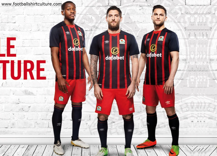
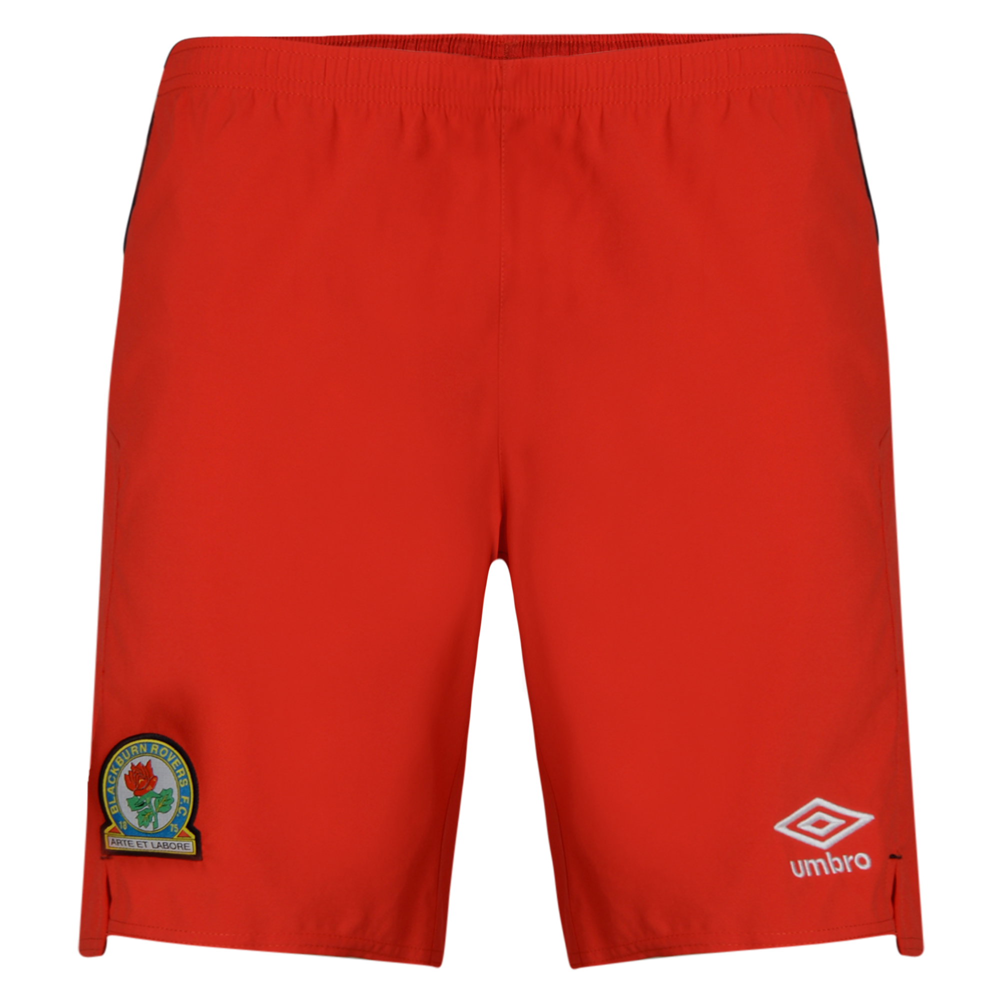
Terrible with the red shorts, should have gone black.
This commment is unpublished.
Paulburn Rovers· 9 years ago
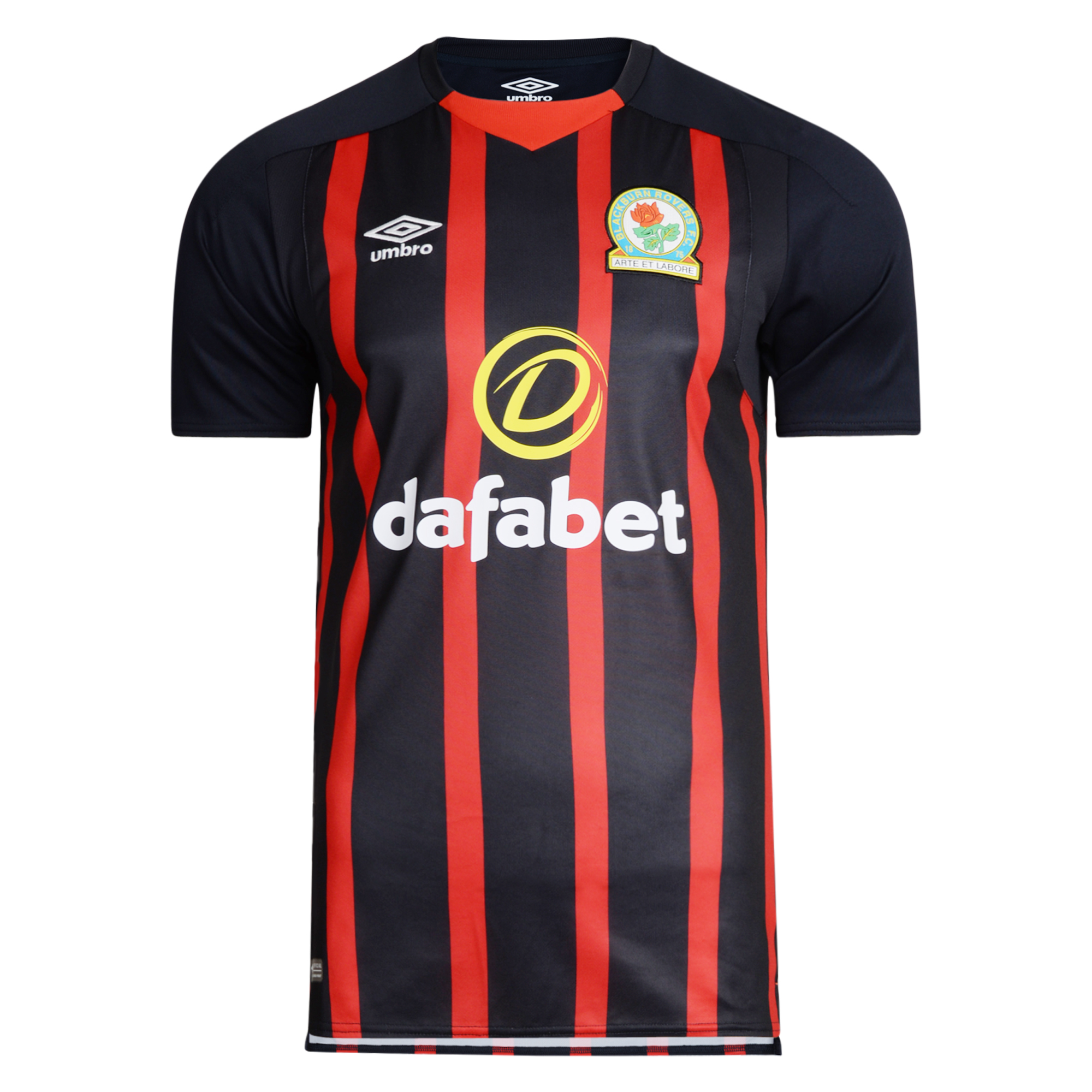
Clean and pleasing on the eye. This is much better than last seasons away kit. Shame the team aren't higher. ROVERS 4 LIFE!!!!
This commment is unpublished.
Paulburn Rovers· 9 years ago
Clean and pleasing on the eye. This is much better than last seasons away kit. Shame the team aren't higher. ROVERS 4 LIFE!!!!
This commment is unpublished.
Stevo· 9 years ago
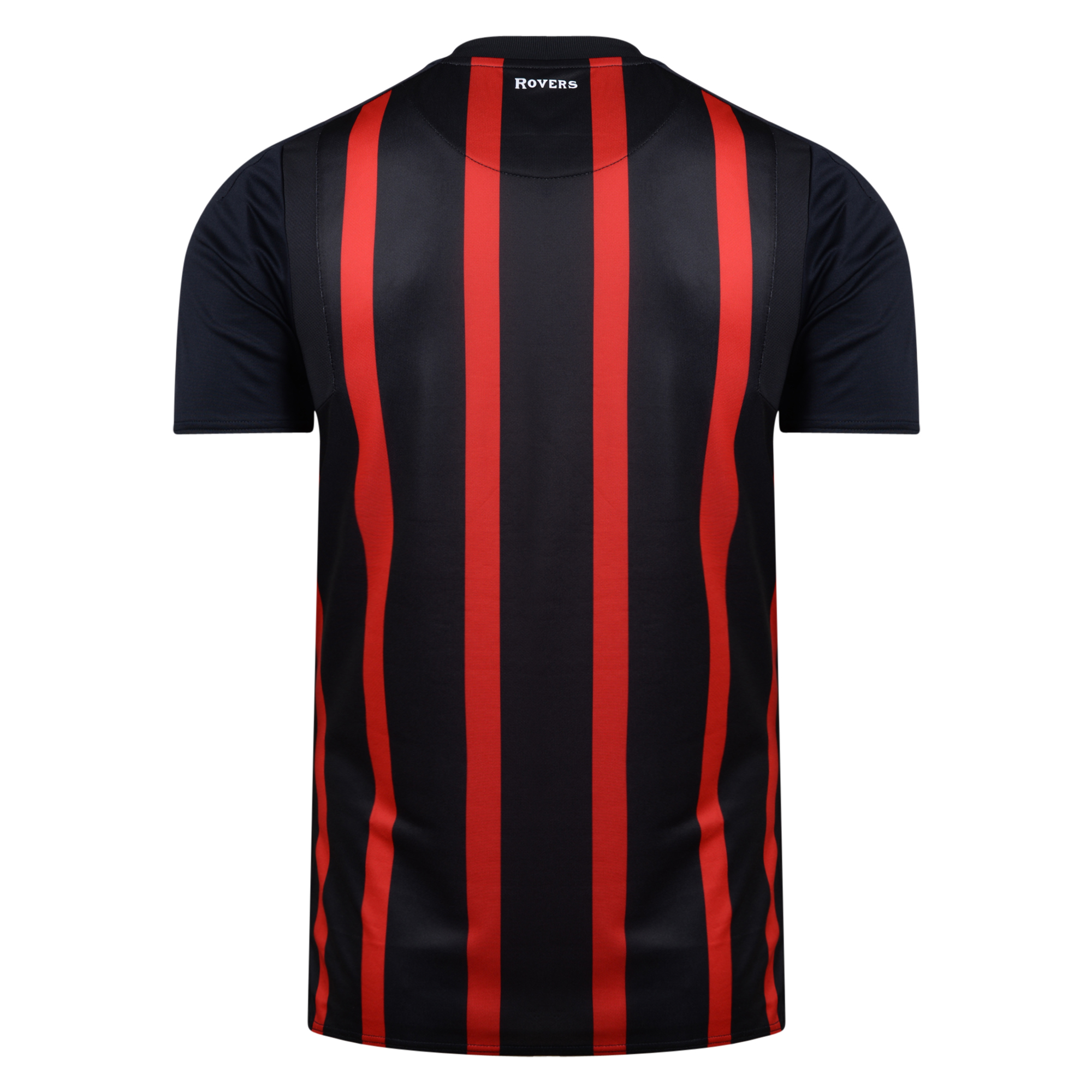
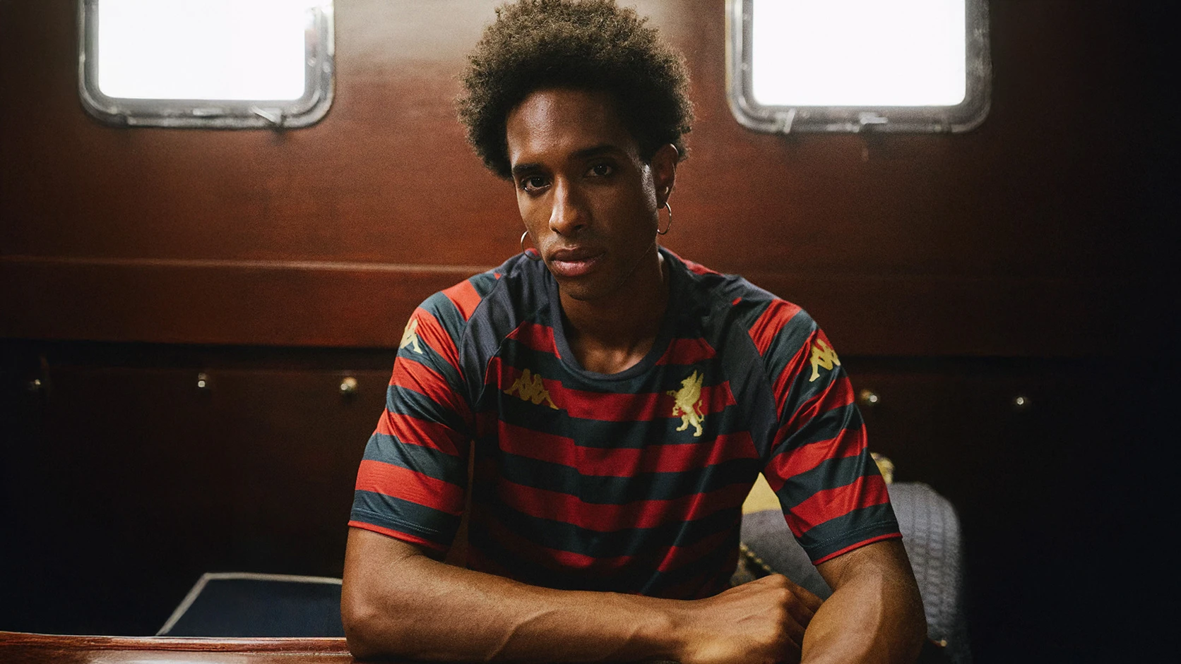
Red stripes are slightly to large, red shorts are a mistake here and the collar is hideous.
This commment is unpublished.
waldo· 9 years ago
Agree with the shorts. Should have a black sides to break up the red.
This commment is unpublished.
Quasar· 9 years ago
A blue and white club going for red and black? Why should that be loved?
This commment is unpublished.
Aj· 9 years ago
Not good....
This commment is unpublished.
BrianB· 9 years ago
@PeteJF The kit from 94/95 had red shorts, though I agree they don't look good with this version I am glad they went for a complete modern version of the kit.
This commment is unpublished.
Councillor Cox· 9 years ago
It's a thing of beauty, love it!
This commment is unpublished.
Terrier· 9 years ago
Nice that,
This commment is unpublished.
Moosey· 9 years ago
Eventually it will get to a point where kits are based on things like 'the strip worn when we got a valuable point away at Hull in 1993' ....