Loading comment... The comment will be refreshed after 00:00.
This commment is unpublished.
Busty bird· 10 years ago
Lovely looking kit. My baps will look epic in one of these
This commment is unpublished.
Daniel-San· 10 years ago
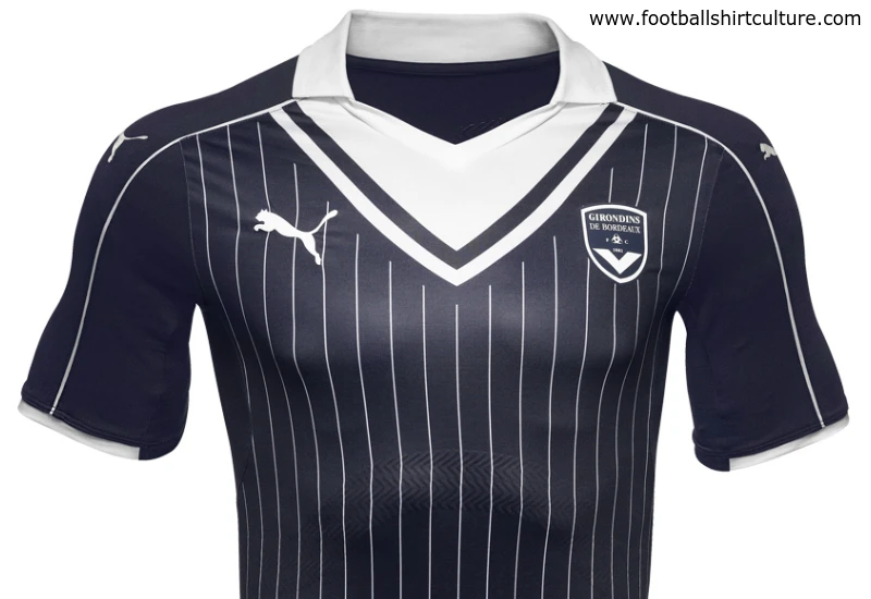
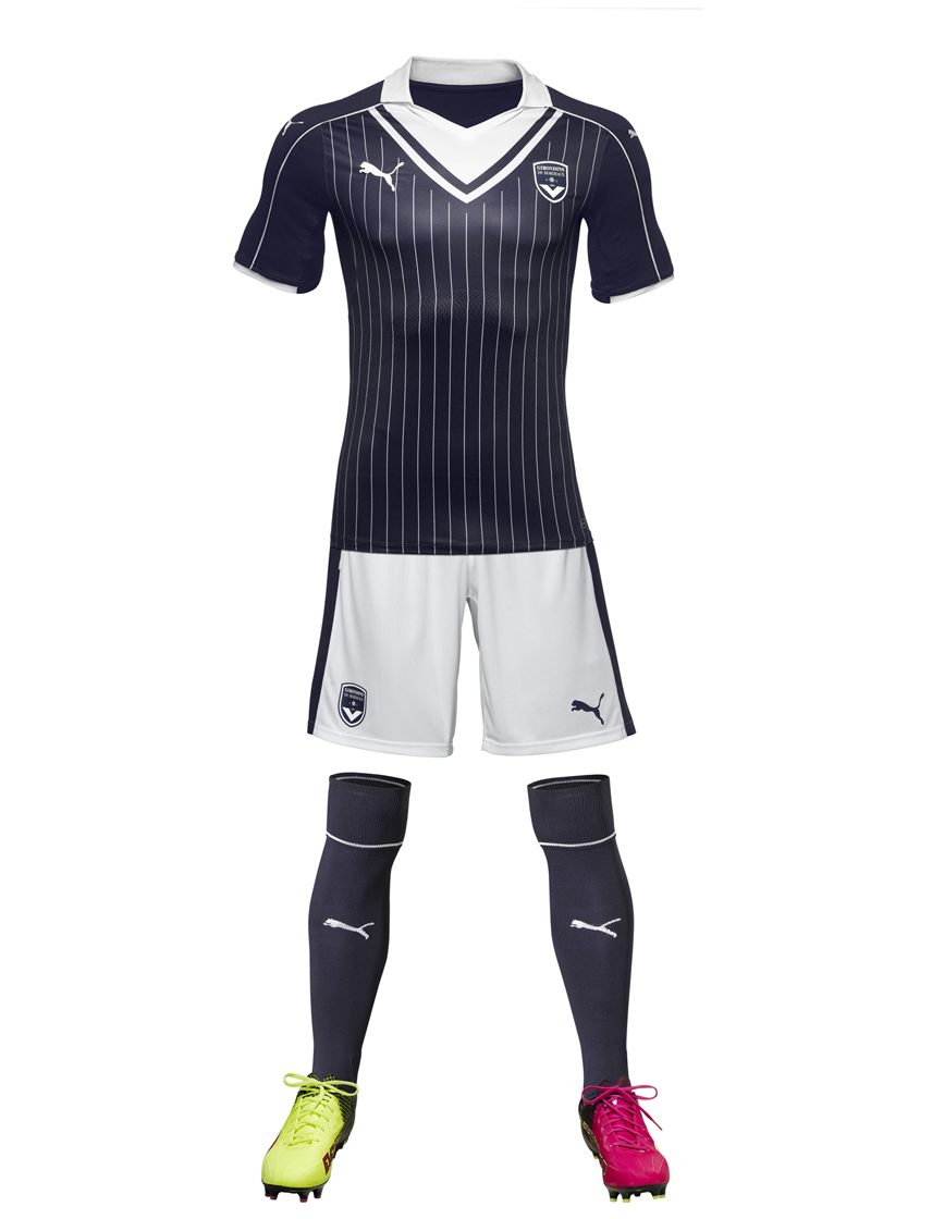
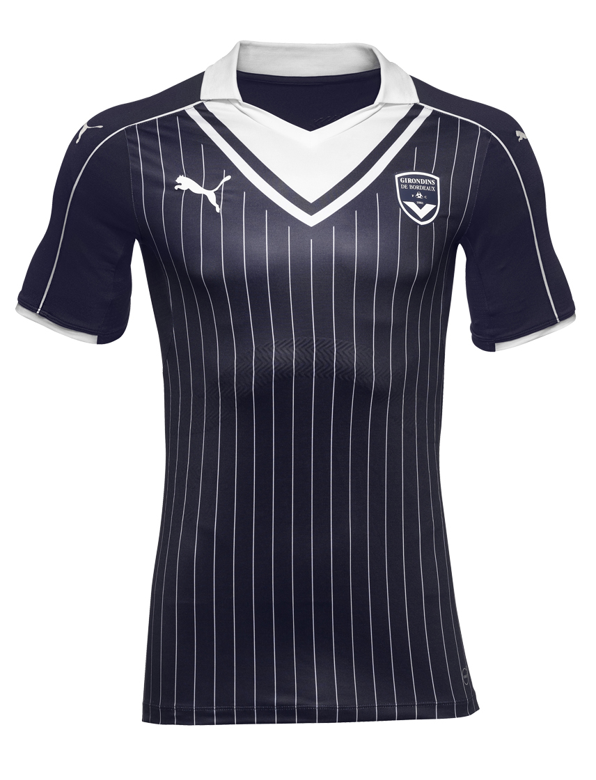
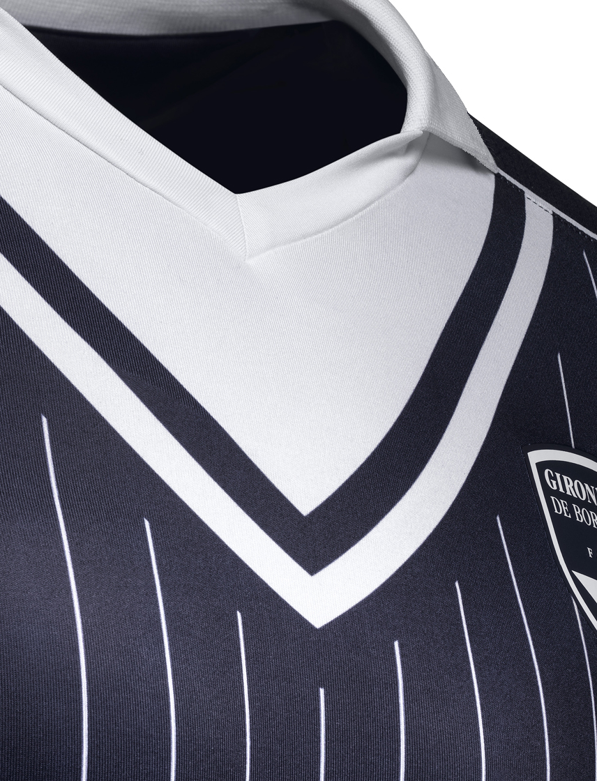
Looks a bit 'naval' with the blue and the big white v-neck. "In the navy...."
This commment is unpublished.
Anthony--· 10 years ago
[quote name="Marseillais"]The collar sure is strange. Still the shirt looks allright in these pictures - because the horrible logo from the sponsor, KIA, is missing[/quote]
Si tu ne vois pas Kia c'et parce que Kia n'est plus sponsor de Bordeaux
This commment is unpublished.
Marseillais· 10 years ago
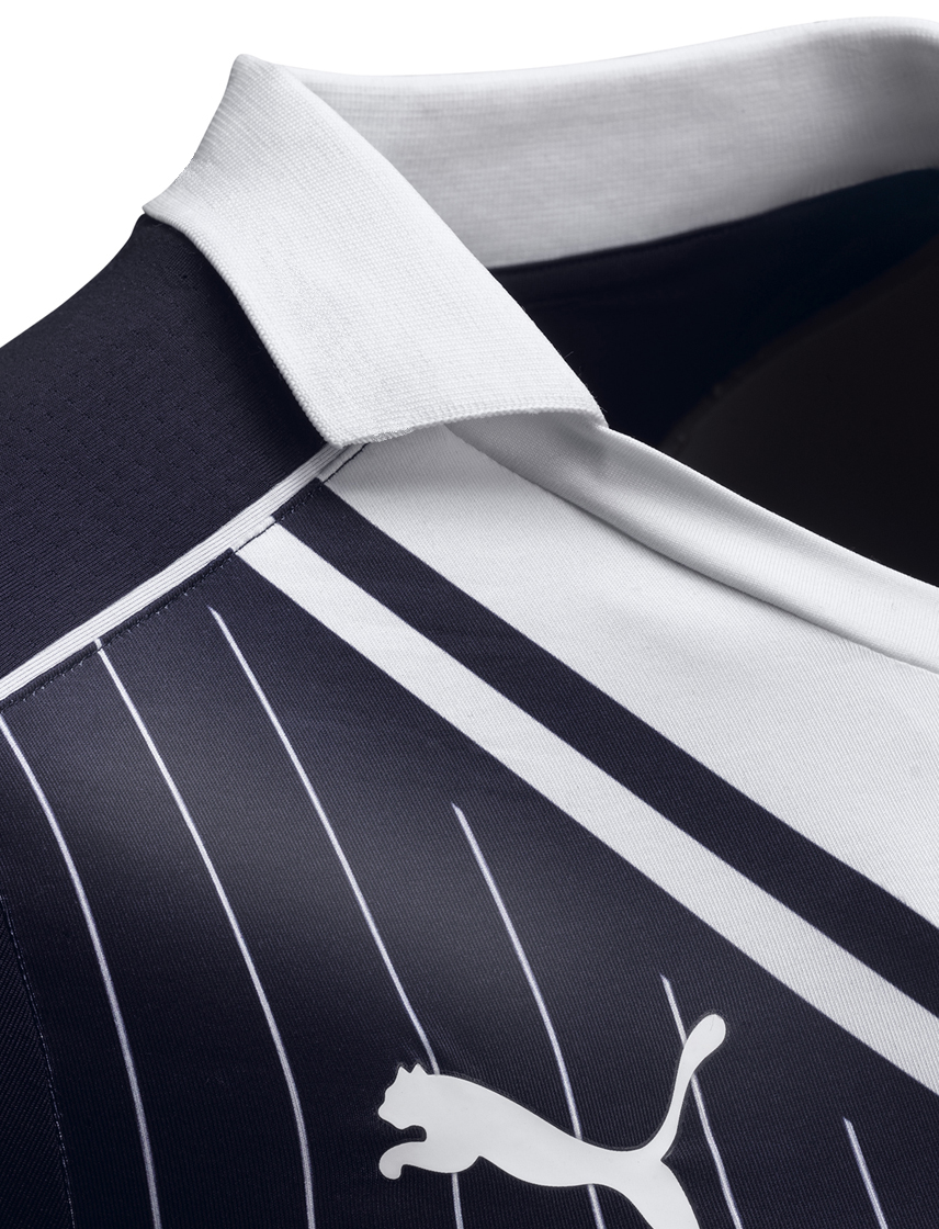
The collar sure is strange. Still the shirt looks allright in these pictures - because the horrible logo from the sponsor, KIA, is missing
This commment is unpublished.
Swanson for Bronson· 10 years ago
Usually not a fan of the faux v-neck look, but I think it works for Bordeaux, as the V is their thing.
This commment is unpublished.
Laslow123· 10 years ago
Absolutely epic.
This commment is unpublished.
The Cat· 10 years ago
That is a thing of beauty!
This commment is unpublished.
Éire· 10 years ago
Nice shirt but a bit too much going on. V-neck, stripes, collar, pinstripes.
Very nice, I really like the idea. Adidas Originals works here, and the flag-font is a very interesting way to integrate the crest to the shirt.
I would just make it more "subtle" or "-)iscreet" (call it as you want), especially on the home shirt where the colours kind of clash (3 different shades of red).
I would have even prefered the away in dark blue with white stripes, and the third in white, but with light-gray details. But good job anyway :-)