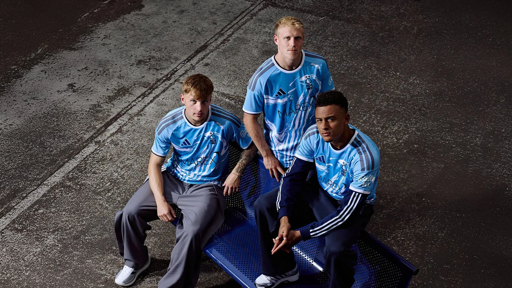

Zenit St. Petersburg unveiled the new 2010 home and away football kits, made by their new kit manufacturer Nike, at the ceremonial hall of the St. Petersburg Artistic and Industrial Academy.
For many years, the main symbol of the team and fans is the colour combination "Blue-white-blue" - the colour code, uniting the city and the club, emphasizing their uniqueness.
That's why design developers at Nike swapped the colour of the home kit from white to blue, using a minimum of design elements to enhance the colour value. The selected home shirt colour is a special shade of blue - Laser Blue, which meets the club tradition and at the same time, looks trendy.
“Season 2010 will mark the beginning of a new phase in the history of "Zenith" - says CEO Zenith Maxim Mitrofanov.
Nike strives to develop products that help improve the achievement of the players on the field, - says the General Manager of Nike football in Russia. - Our innovation has served the best football clubs in the world and today we are pleased to offer the most modern technology to the "Zenith" players. For us, "Zenit" - is a unique team, which embodies the character of their town.